We can’t send you updates from Justia Onward without your email.
Unsubscribe at any time.
Your website homepage often is the first impression your law firm makes on new clients! Plus, it plays an integral role in your SEO strategy and online visibility. To learn more about the essential elements of your law firm website's homepage, check out this post!
The homepage is one of the most important pages for your law firm website. It is one of the most frequent landing pages for visitors and creates a first impression. At a minimum, the homepage should tell website visitors who you are, what you do, and where you practice, but the best homepages do so much more.
In order to fully leverage the SEO value and conversion potential of your homepage, you’ll need to establish your brand, communicate your law firm’s value, demonstrate your expertise, and make strategic design decisions to encourage conversions.
In this article, we’re diving into 14 essential elements for your law firm website homepage. Read on to see if your own site is up to par and discover what you could be missing!
An Overview of the Homepage
Your website homepage contains a lot of important information about your law firm. At a glance, it shows your firm name, contact information, photo, and introductory text.
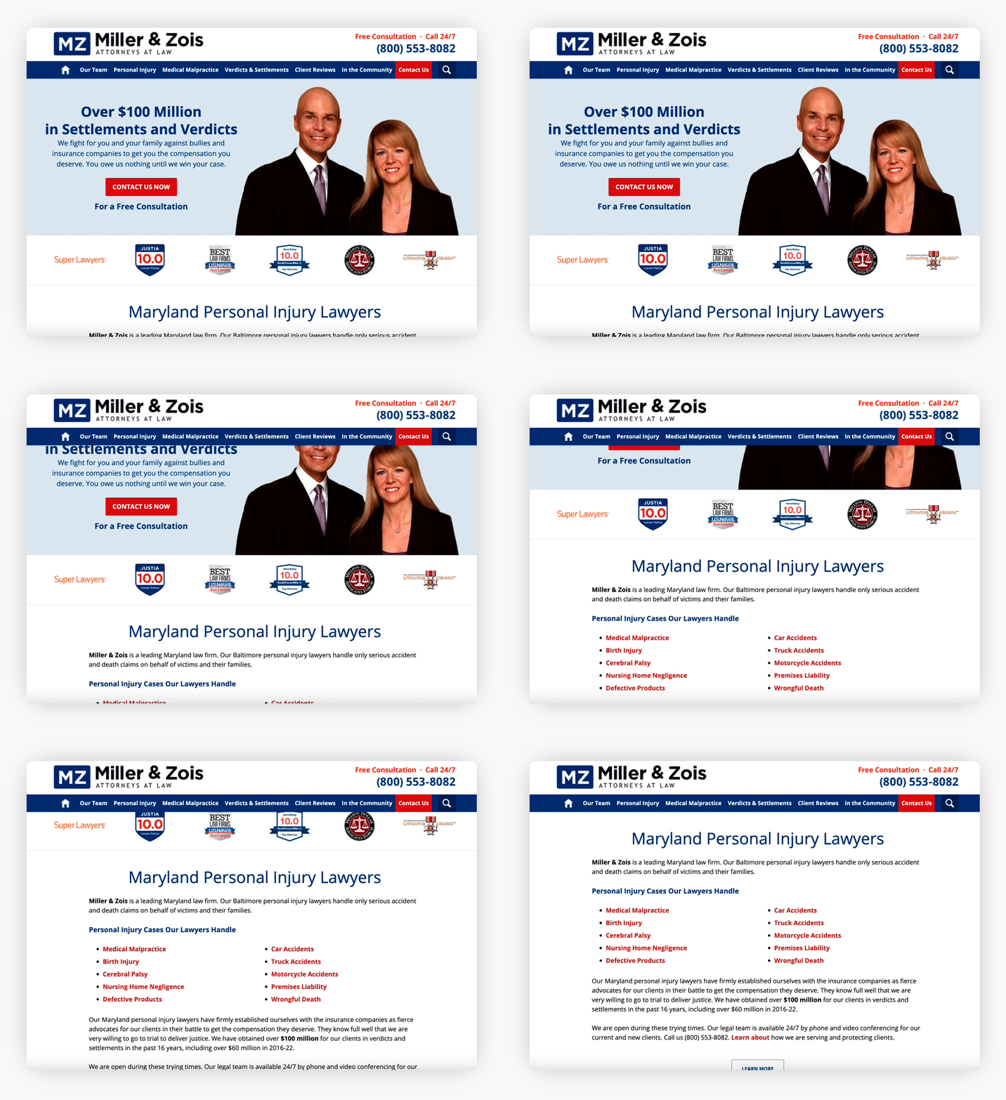
On desktop, the sticky header at the top of your page contains key information such as your law firm logo, calls to action (CTAs) for the user, your phone number, and the top navigation bar. The sticky header follows website visitors as they scroll on the page.
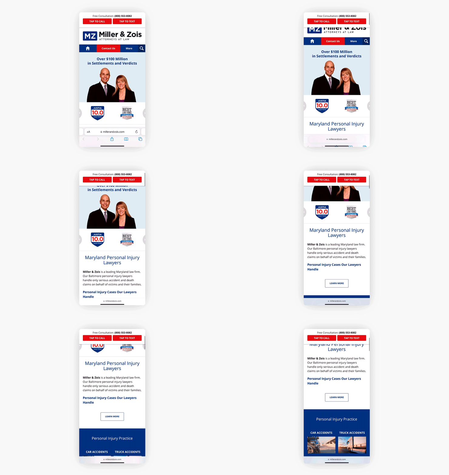
The sticky header on mobile contains a CTA, such as “Free Consultation”, along with your phone number and tap-to-call/tap-to-text buttons as applicable.
Now that you have this visual in mind, we’ll break down the essential elements of your homepage in more detail.
1. Logo & Tagline
A well-crafted law firm website logo and tagline are of paramount importance in today’s digital age. It creates a powerful first impression on potential clients and colleagues alike. Your logo and tagline also play an important role in your law firm’s branding. Effective branding not only establishes trust and credibility but also sets the firm apart in a competitive market. A strong online presence communicates your firm’s values, experience, and unique selling points, helping you connect with your target audience more effectively.
Moreover, consistent branding across the website reinforces your firm’s identity and fosters recognition, making it easier for clients to recall and recommend your services. In essence, a thoughtfully designed law firm website logo and tagline is not just about aesthetics; it’s a strategic tool that can significantly impact your law firm’s success and reputation in the legal industry.
Here are some examples of websites with unique, memorable logos and taglines:
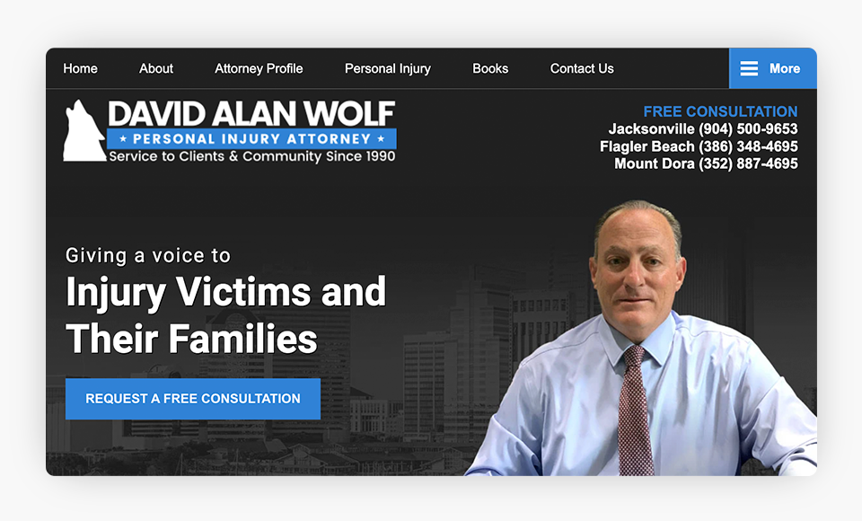
The wolf imagery in the logo graphic ties in with the attorney’s name “David Alan Wolf” and is easily recognizable.
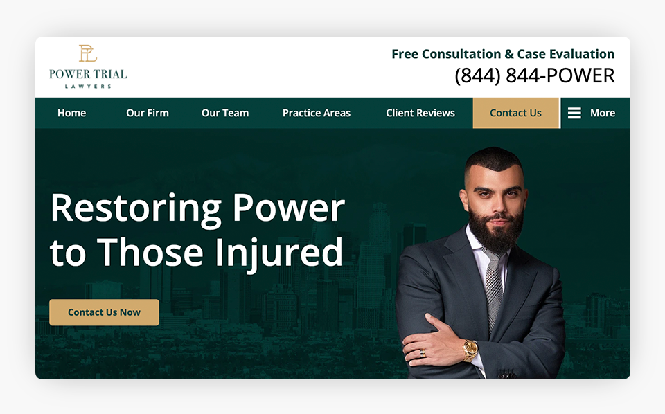
The tagline “Restoring Power to Those Injured” ties in with the name of the firm, “Power Trial Lawyers”. The theme of power is also carried over in the phone number (844) 844-POWER. It can be helpful to use a catchy, easily remembered vanity number, as shown in this example, if you do other advertisements on radio or TV.
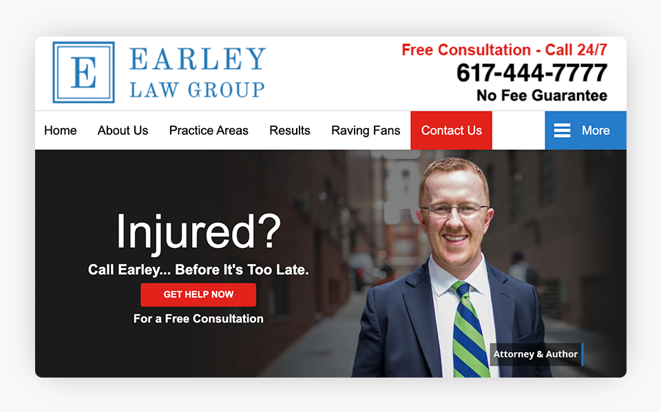
The attorney’s tagline “Injured? Call Earley…Before It’s Too Late.” is a play on the name of the firm, “Earley Law Group”.
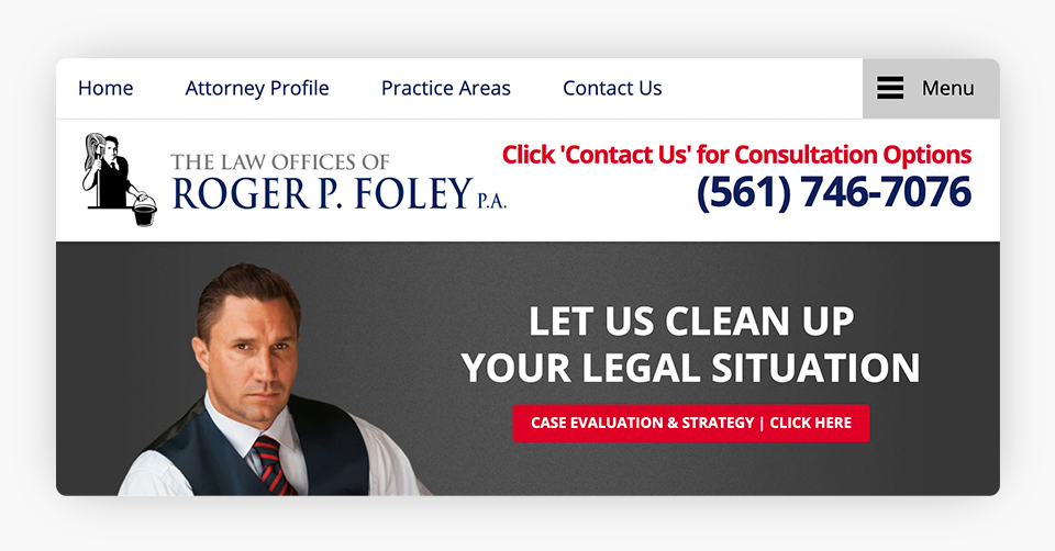
The logo imagery of the attorney with a mop and bucket coordinates with the tagline “Let Us Clean Up Your Legal Situation”. This unique logo and tagline is sure to make a memorable impression on website visitors.
2. Calls to Action & Phone Number
Calls to action and prominently displayed contact information are vital components of a successful law firm website. These elements bridge the gap between online visitors and potential clients by encouraging engagement and facilitating easy communication.
CTAs strategically placed throughout your website, such as “Free Consultation” or “Available 24/7,” prompt visitors to take the next step, converting them from passive browsers into active leads. Meanwhile, clear and readily accessible contact details, including phone numbers, email addresses, and office locations, further instill trust and boost your firm’s credibility.
In the legal industry, where personal connections and prompt communication are of the utmost importance, having your contact information readily available helps prospective clients feel more comfortable and confident in reaching out for legal assistance. Ultimately, the combination of compelling CTAs and easily accessible contact information ensures that a law firm’s website not only attracts visitors but also effectively converts them into new clients.
Below are some examples of effective header CTAs for particular practice areas. Remember, it is important to use a high-contrast color for your CTAs so they stand out. Red CTAs and contact buttons tend to be particularly effective in encouraging conversions.
Personal Injury

Many personal injury lawyers offer a free consultation or case evaluation.
Criminal Defense

Since crimes can happen at any time, many criminal lawyers offer 24/7 availability.
Family Law

Most family law attorneys do not offer a free consultation, so they include alternative CTAs.
3. Make It Easy to Contact You
At the end of the day, your website should be designed to make it easy for users to convert. Design elements such as contact buttons, contact forms, tap-to-call buttons, tap-to-text buttons (if applicable), and live chat can make it very easy and convenient for prospects to communicate with your firm.
They provide a structured way for individuals to reach out with their legal inquiries and allow visitors to provide essential details about their situation upfront, which can help attorneys better understand the nature of the case. This streamlines the intake process, allowing for more focused and productive future interactions.
Additionally, you can tailor your contact forms and intake process to gather essential information relevant to different practice areas, ensuring that inquiries are directed to the appropriate attorney. In a digital age where convenience is highly valued, making it easy to contact your firm is vital in creating a positive and professional online experience for your law firm’s potential clients.
Below are some examples of ways that you can make it easier for prospective clients to contact your law firm.
Contact Us Tab and Contact Us Button
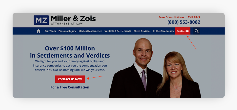
The “Contact Us” tab and “Contact Us Now” button in the banner area take users to a user-friendly contact form.
Bottom Contact Form
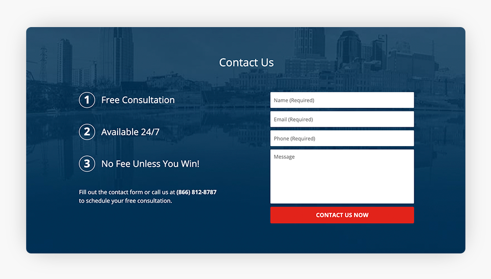
The bottom contact form on this homepage includes three numerical items on the left side, which highlight important calls to action to help increase conversions.
Tap-to-Call and Tap-to-Text
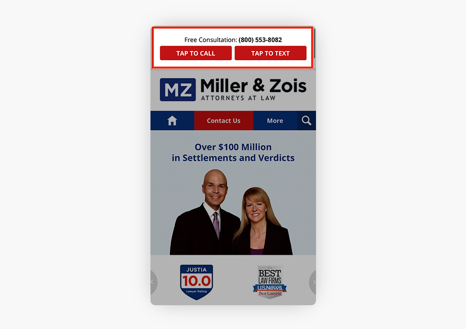
Mobile tap-to-call buttons are critical for increasing conversions. In addition, a tap to text button, if applicable, can make it very easy and convenient for prospective clients to contact you.
Live Chat
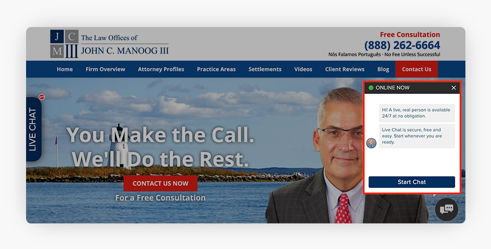
Live chat offers yet another way for clients to contact your firm. It’s important to ensure that your live chat is AMP (Accelerated Mobile Pages) enabled and potential clients are able to communicate with a live person in real-time.
4. Easy Navigation
Easy navigation is important for a successful law firm website, as it plays a pivotal role in ensuring that visitors can quickly and effortlessly access the information they need.
In the legal field, potential clients often arrive at your website seeking specific information about your law firm and your services, practice areas, and attorneys. An intuitive, user-friendly, and well-organized navigation structure helps visitors find what they are looking for without frustration.
Easy navigation enhances the user experience, encouraging your website visitors to stay longer and explore more of your site’s content. Additionally, an easy-to-navigate website reflects positively on your law firm’s professionalism and commitment to client satisfaction. In a competitive market, where online visitors have numerous choices, an intuitively designed website can be the key to retaining their interest and ultimately converting them into clients.
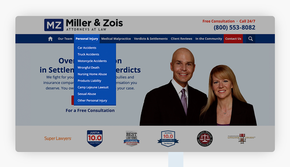
Here are some examples of easy-to-use navigation menus on desktop and mobile.
Desktop
Mobile
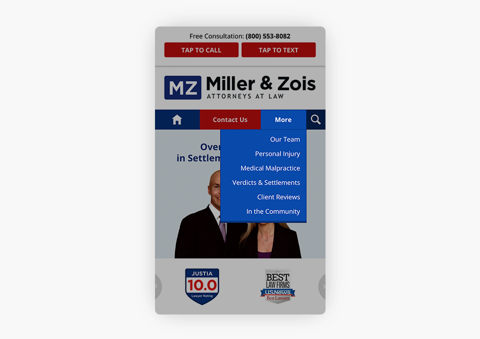
Users should be able to effortlessly navigate your website on both desktop and mobile with an easy-to-use top navigation bar. Keep your drop-down menus simple to reduce visual clutter.
5. Header Image
A compelling header image holds significant importance for your law firm website, serving as the digital equivalent of a welcoming handshake and setting the tone for the entire online experience.
A well-chosen header image of you as the attorney, or of your team, can convey a sense of professionalism, trustworthiness, and competence, instilling confidence in potential clients. It also reflects the firm’s personality and values, helping visitors connect with the practice on a more personal level.
Moreover, visually appealing header images, such as the examples below, captivate the visitor’s attention, encouraging them to explore further and engage with the site’s content. A good header image has the power to make a memorable first impression and leave a lasting positive impact on visitors to your law firm’s website.
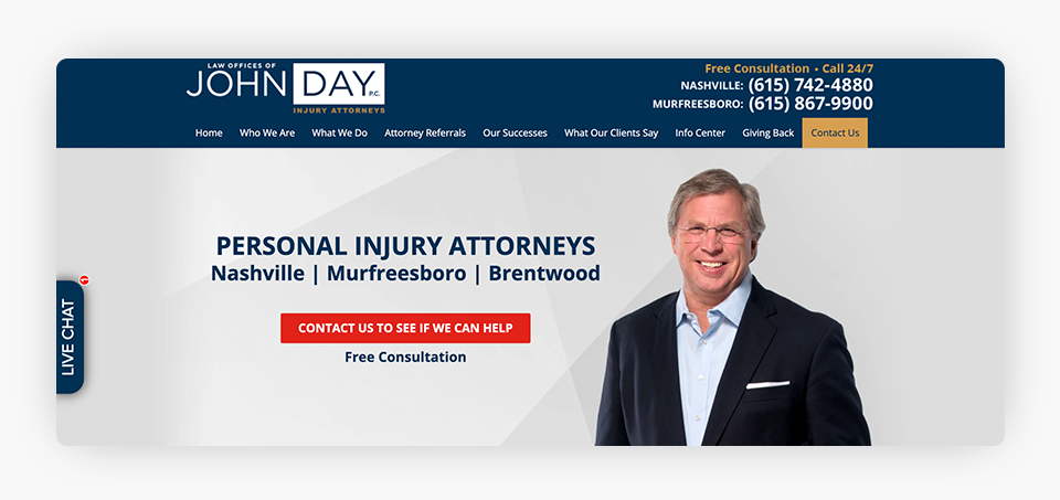
For most legal practice areas, the attorney should be smiling and looking directly at the camera.
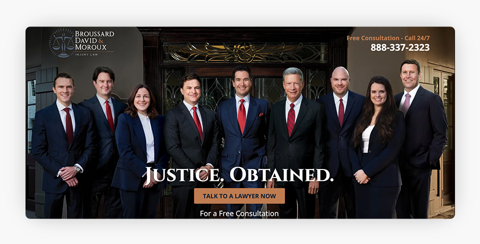
Some law firms opt to use larger group images showcasing their team.
6. Showcase Social Proof
Including social proof on a law firm website is essential in building trust and credibility with potential clients. Case results, awards and achievements from reputable organizations, client reviews, media mentions, and social media profiles showcase your firm’s record of success.
In a field where trust is a critical factor in a new client’s decision-making process, social proof serves as powerful evidence that the firm has a history of positive outcomes and satisfied clients. Social proof helps potential clients feel more confident in their choice of legal representation and demonstrates that the firm is well-regarded within the legal community. Furthermore, social proof fosters a sense of transparency and authenticity, as it provides real-world examples of your firm’s capabilities and the positive impact your practice has had on clients’ lives. Ultimately, integrating social proof into a law firm’s website can be a persuasive factor that encourages visitors to take the next step in seeking legal counsel.
In the examples below, we discuss some specific ways that you can incorporate social proof on your website.
a. Case Results

Firms should focus on advertising their wins in the case results strip. For instance, this case results strip for a personal injury website showcases dollar amounts and case types.

Firms may also wish to focus on advertising their experience in different types of cases, in addition to case outcomes. For instance, this criminal defense law firm website highlights case types and outcomes.
Case results strips tend to be placed near the top of the page (e.g. below the main image area), so that they are one of the first things a potential client sees.
b. Badges for Awards, Accolades, and Achievements

The badges, awards, and accolades on your website serve as marketing collateral for your firm by enhancing your credibility. Similarly, badges tend to be placed near the top of the page below the main image area to help increase conversions.
c. Client Reviews
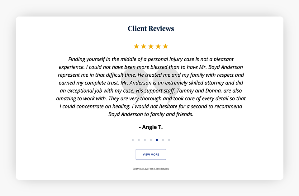
Website visitors place great value on client reviews. You should curate the reviews on your site to put your best foot forward. You have full control over the client reviews that appear on your website, whereas you don’t have control over the reviews that appear off of your site, such as on your Google Business Profile (GBP). Client reviews strips tend to be strategically placed a bit lower on the page so that users will see them as they scroll.
d. Media Mentions

Media mentions from well-known or reputable news organizations, publications, and media outlets showcase your legal experience and authority. Media mentions are often placed lower on the page, such as above the bottom contact form, which can help from a conversion standpoint.
e. Social Media Links

Many prospective clients want to gather more information about your law firm or your attorneys, even after viewing your law firm website. Including social media links on your website makes it easier for clients to access your official social media pages, which helps to facilitate a sense of trust. Like media mentions, social media links are often placed lower on the page, typically in the footer.
7. Homepage Narrative
Your homepage narrative is not only a compelling way to engage visitors, but also serves as a valuable asset for your law firm website search engine optimization (SEO).
Search engines, like Google, are increasingly prioritizing user experience and quality content. A well-crafted homepage narrative not only provides visitors with a clear understanding of your firm’s mission, values, and services but also strategically incorporates relevant keywords and phrases. This helps search engines understand the website’s focus and context, leading to better rankings in search results for relevant queries.
Moreover, an engaging narrative can encourage visitors to spend more time on the site, reducing bounce rates and signaling to search engines that the website is providing valuable content. In essence, a homepage narrative that seamlessly combines user engagement with SEO optimization can enhance your law firm’s online visibility and help attract a broader audience of potential clients.
Recommended Structure
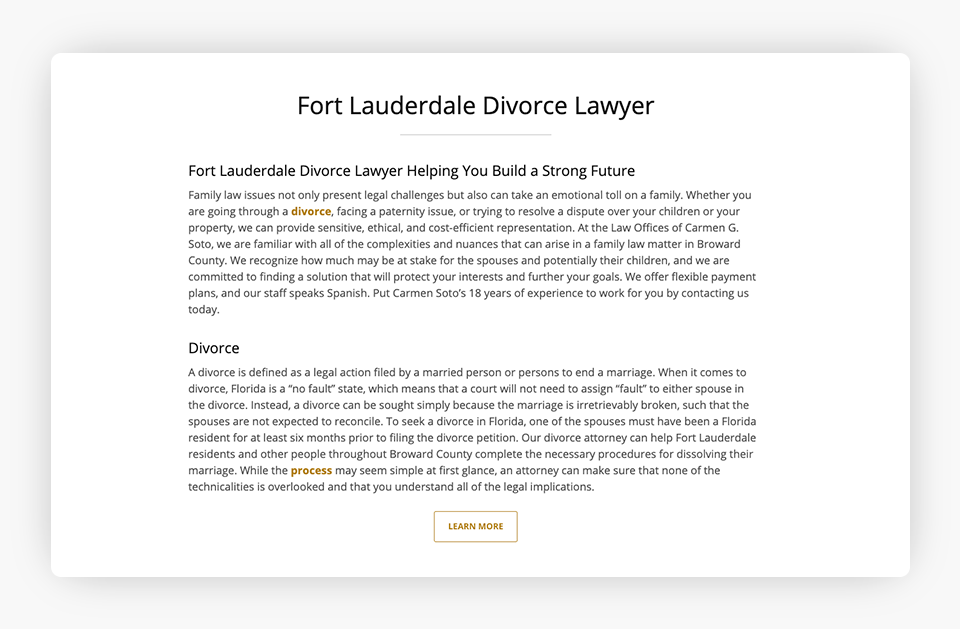
In order to maximize the SEO benefits of your law firm website homepage, you should include the following in your narrative:
- Introduction: This should answer who you are, what you do, and where you practice. Also, be sure to emphasize any awards, accolades, or distinctions.
- Body: Include a paragraph per priority practice area.
- Conclusion: Summarize the key points, including CTAs and contact information.
Keywords typically consist of [locality] + [practice area] + [lawyer], and should be incorporated within your homepage narrative in a natural manner.
You should also crosslink to internal practice area pages within your homepage narrative.
Note: The homepage narrative screenshot below is just an excerpt. The “Learn More” button expands the full narrative.
8. Practice Areas Strip
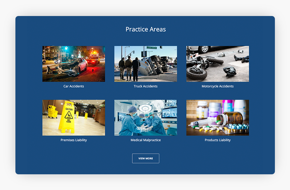
The practice areas strip should highlight the priority cases for your firm. The strip doesn’t need to be exhaustive as you can include a “View More” link to take users to a page with the full list of your law firm’s practice areas, as shown in the example below.
9. Attorney Profiles Strip
The attorney profiles strip serves several crucial purposes for your law firm website. First and foremost, it provides transparency and establishes trust by showcasing attorneys’ headshots, and providing a snapshot of their qualifications, experience, and professional backgrounds. Prospective clients want to know who will be representing their interests, and your attorney profiles offer that personal connection while providing reassurance of your team’s legal capabilities.
Additionally, users can typically click on the individual photo of an attorney or a “View More” button within the strip to view an attorney’s full profile. From an SEO perspective, attorney profiles are often some of the most visited pages on a law firm website. Overall, having the attorney profiles strip on your website homepage bolsters your law firm’s credibility and online visibility, while increasing client engagement.
Below are a couple of examples of attorney profiles strips:
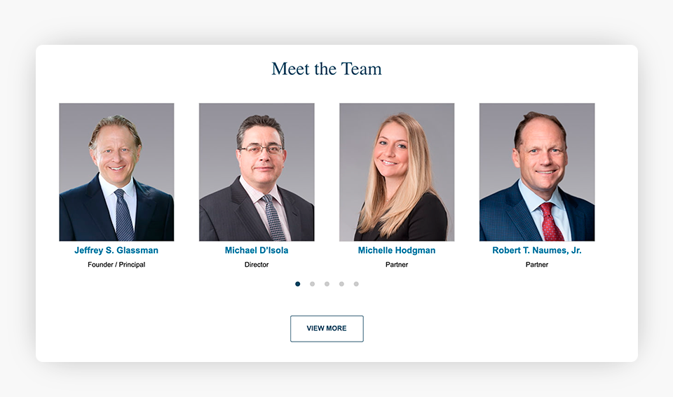
If your firm has several attorneys, you may consider having a rotating strip.
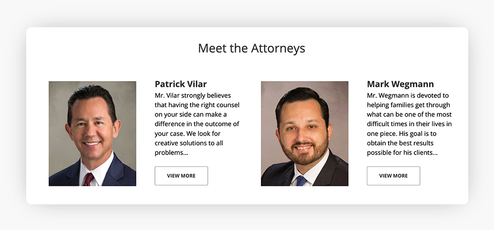
Depending on the layout of the attorney strip, you may also include a short description next to your attorney photos, as shown above.
10. Blog Strip
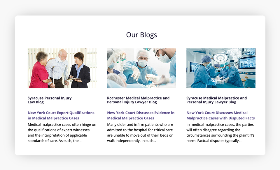
Including a strip with your latest blog posts makes it easy for website visitors to access additional legal information. Blogging also further demonstrates your legal acumen and can be a valuable tool to further enhance your SEO.
Here’s an example of a strip featuring multiple blogs:
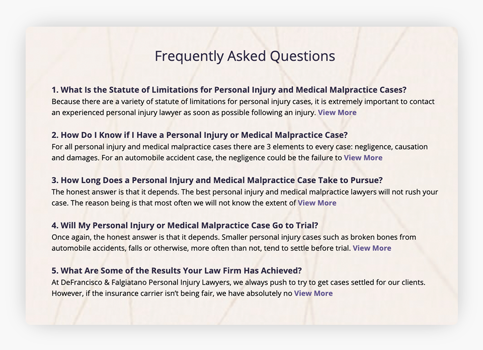
11. Frequently Asked Questions (FAQs)
Incorporating FAQs on your homepage helps address some of the most common questions prospective clients have for your law firm. FAQs can also help capture more traffic for longtail searches.
Below is an example of an FAQ strip on a law firm website:
12. Videos and Additional Resources
Videos offer website visitors a glimpse into the attorney’s personality and level of competence, often before they have even met the attorney. If you don’t have videos to include on your site, you could highlight other items to ensure your law firm website homepage stands out, such as books authored by your attorneys, firm newsletters, or additional compelling reasons why a prospective client should hire you. While you do not have to include all of these resources on your homepage, some law firms choose to do so.
Below are some examples of strips with videos and additional resources:
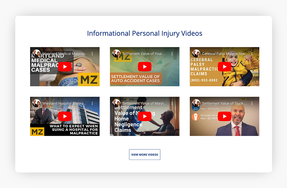
Including high-quality videos on your site can provide valuable information to clients, encourage website engagement, and demonstrate your expertise.
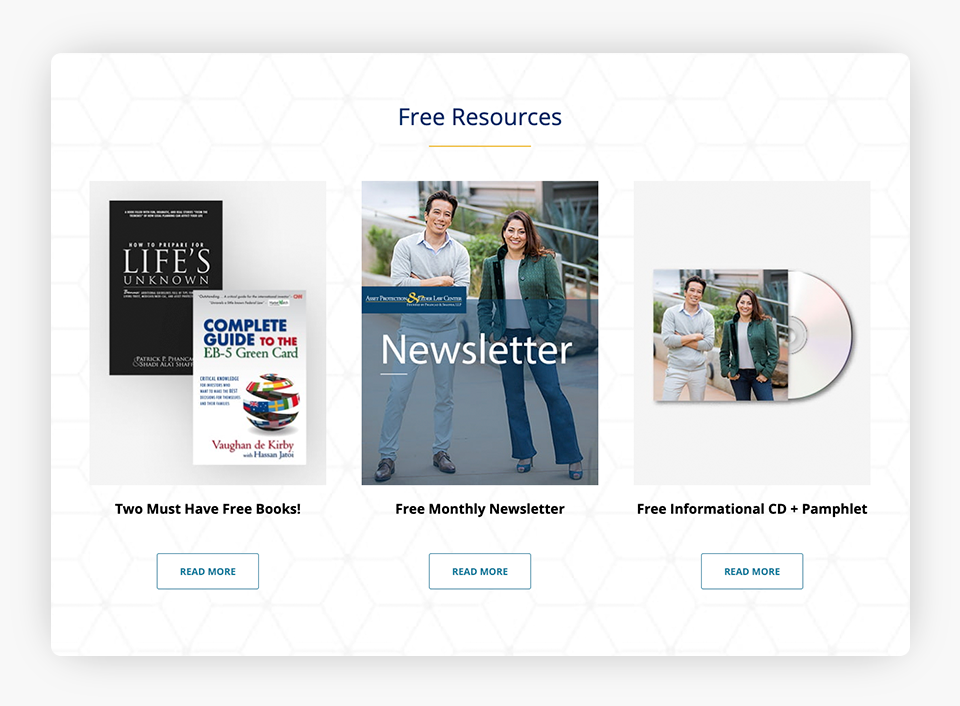
Similarly, including a strip with additional resources, newsletters, or downloadable e-books helps provide valuable information for potential clients and demonstrates your authority in the legal space.
13. Include Your Address & Contact Information in the Footer
From an SEO standpoint, it’s important to maintain consistency with your Name, Address, and Phone Number (NAP) throughout your web properties. Adding your address and contact information in your website footer reinforces your NAP consistency, which in turn can improve your local visibility.
On a technical level, your web provider should add schema markup for your website’s NAP information, which can enhance your website visibility in search engines.
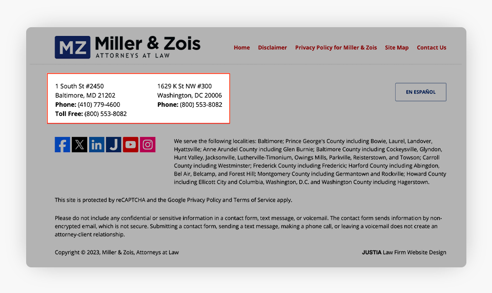
Your firm’s address and contact information in the footer will be visible on all of your website pages.
14. Ensure Your Site Is Mobile-Friendly
Ensuring that your law firm website is mobile-friendly and AMP enabled is essential in today’s digital landscape. With a growing number of people accessing information and services on their mobile devices, a mobile-friendly website ensures that your content is accessible and visually appealing to a broader audience. This is particularly important for individuals seeking legal assistance, as they might require immediate access to your services while on the go.
Furthermore, AMP enhances the mobile user experience by improving website load speeds, which are critical for retaining visitors and reducing bounce rates. In a competitive online environment, where user experience directly impacts search engine rankings, having a mobile-friendly and AMP-enabled website not only ensures that you reach a wider audience but also improves your website’s visibility, ultimately increasing the likelihood of attracting and retaining potential clients in an increasingly mobile-centric world.
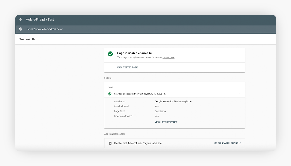
The following screenshot shows an example of a website that is mobile-friendly per Google’s Mobile-Friendly Test tool.
Final Thoughts: Why Do You Care?
Your law firm website homepage says a lot about you and your practice, and it has the potential to help you significantly build your business. As there are numerous law firm websites on the internet, it’s important that you are well-equipped with the tools and SEO strategies to maximize your organic visibility and convert website visitors into qualified leads.
Watch this clip to learn more about your website’s homepage.
Need more help? Our team of qualified legal marketing experts can help you develop a fully optimized website on our Justia Elevate platform. In addition to websites, we also offer other various digital marketing solutions to help grow your business. Contact us today for a free consultation!
Related Posts