We can’t send you updates from Justia Onward without your email.
Unsubscribe at any time.
If you are considering some spring cleaning for your law firm website design in 2023, there are some best practices we recommend keeping in mind. Check out this post to learn more.
As we enter the spring and summer months, you may be considering refreshing your law firm website for the second half of the year. A well-designed website is undoubtedly crucial for lawyers in the 2023 digital age.
Your website is often the first point of contact between your law firm and new clients, the general public, and even other lawyers! Plus, your law firm’s website can significantly influence a client’s decision to choose your law firm over another. When looking to convert website visitors into your clients, an effective website design immediately gives you more easy wins.
New design trends can modernize your law firm website and create a more visually appealing look for visitors. However, it is also important to remember that your website needs to be functional. The primary purpose of your law firm’s website is often to help you reach new clients. Thus, you want it to appeal to visitors.
Designing an effective law firm website requires specialized expertise and a unique approach that considers the legal industry’s specific needs and unique audience. As you evaluate 2023 spring cleaning for your law firm website, check out this post for some web design best practices for lawyers to help you create a website that stands out and attracts potential clients.
Best Practice 1: Implement a Mobile Friendly Design
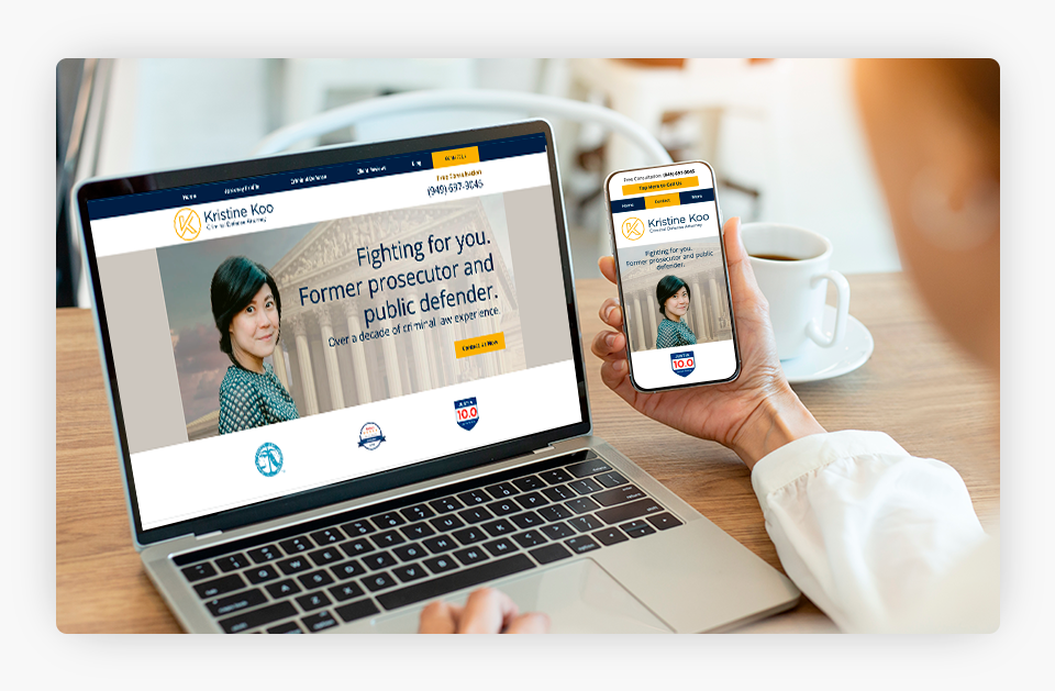
Today, we live in a mobile-first world. The percentage of global web traffic coming from mobile phones has surged in recent years – just think of all the times you have pulled out your cell phone to look for information quickly. Your law firm’s future clients are no exception. Thus, optimizing a mobile device website is crucial for any business, including law firms.
Mobile-friendly website design is about creating a website that adapts to different screen sizes, loads quickly, and is easy to use on mobile devices. For law firms, this means designing a website that is accessible and easy to navigate on a small screen with clear, concise content. Following two key practices can help your firm make considerable strides in your efforts at creating a mobile-friendly website:
- Utilize Responsive Web Design: Responsive web design is a design approach that ensures a website looks good and functions properly on any device, regardless of its screen size. Responsive websites dynamically adapt the layout, content, and images to devices of various sizes, from desktops to mobile phones and tablets. This means your clients, and other target audiences, have an optimized viewing experience however they may be looking for you.
- Prioritize Mobile Usability: For mobile users, speed matters. It is key to usability. If your website does not load quickly on mobile devices, you miss connecting with potential clients and others. To prioritize speed, be sure your website does not include design elements that unnecessarily slow load times, such as large videos or unoptimized images. Also, check your website’s performance on industry-leading tools like Google PageSpeed Insights.
Finally, take advantage of AMP, an open-source initiative to make webpages that load quickly on mobile devices. With AMP, you create a mobile-friendly copy of your law firm website stored on servers nationwide, and this AMP site preloads in the background of users’ devices when performing mobile searches.
Best Practice 2: Focus on Usability
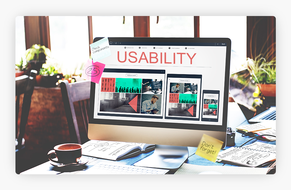
Usability doesn’t just matter for mobile website performance. It also counts on desktop devices. Your website visitors expect your website to be usable to find the information they are looking for, and while several factors influence your website usability, design is undoubtedly key.
Speed is one of the key factors for usability on desktop as well as mobile, and studies have shown that speed increases conversions. Page load speeds are often a visual designer’s problem. A highly visually appealing website doesn’t matter if slow load times ruin the visitor usability experience and hinder your law firm’s digital outreach efforts.
Some of the most common design problems impacting your law firm website can be solved by following these tips:
- Optimize Videos and Images: Resize the images on your law firm website and use appropriate formats to ensure your images load quickly and don’t lag behind your other website content. Likewise, you should exercise caution when incorporating videos onto your website to ensure they do not slow it down.
- Avoid Custom Fonts: Not every font is available on a user’s computer by default. While they may enhance the look and feel of your website, custom fonts are likely to slow down your web pages because they are an additional downloadable resource. These are render-blocking resources, meaning your website page will not display correctly until the font downloads.
- Eliminate Unnecessary Elements: Remove any visual elements that are not essential to its functionality or your website visitors’ user experiences. Extra visual elements do not help you and can only slow your site down.
- Minimize Your Usage of Plugins and Widgets: Flashy website plugins and widgets look great on paper and may offer your website sleek, new features. However, think twice if they are unnecessary for your website functionality. Outdated or unnecessary elements can significantly slow your website down.
Best Practice 3: Prioritize Web Accessibility
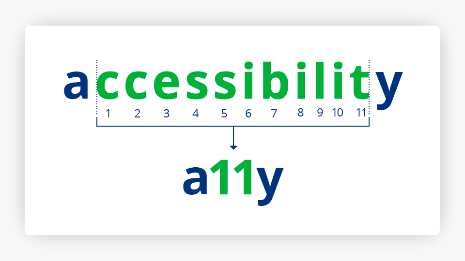
Web accessibility refers to designing and developing websites that all people can access and use, regardless of their physical or cognitive abilities. The goal of web accessibility is equal access by ensuring all people can obtain the information on a website and take advantage of its full functionality.
Additionally, failing to maintain an appropriately accessible website may often carry legal implications in a rapidly changing area of U.S. law. Lawyers need to prioritize web accessibility both to ensure they are adequately serving all audiences, as well as to ensure the law firm is not running afoul of any applicable laws.
While several factors are involved in creating an accessible website, many design elements play a direct role in ensuring your website is accessible. Some of the key web design points to remember when developing or refreshing your website include:
1. Focus on Text Legibility: Text legibility directly results from the typeface/font size, spacing, and contrast on your law firm’s website. The layout of text, length of text, and page orientation also all impact legibility. The arrangements of these elements directly play into your website accessibility.
You want to ensure your webpage content is easily read across different screen sizes and resolutions. Thus, you want to use clear font sizes that most people can read. Your site should also use high-contrast colors for texts and backgrounds.
2. Utilize Structured Data: Giving your website a structured hierarchy is essential. It creates the integral roadmap of your site. While a non-designer may not always see the hallmarks of structured data on your web pages, it is certainly working behind the scenes to set you up for success.
In addition to telling search engines what information is on your page, structured data can also help various assistive technologies assess the information on your site and share it with users.
3. Don’t Forget the Accessibility of Standard Visuals: Images, videos, and other visual elements play vital roles in your law firm website. You want users of all abilities to have access to these elements too. Thus, you should be sure you add Alt-Text for images on your website describing what is in the visual. You should also add closed captions and/or transcripts to your videos for those with hearing impairments.
4. Consider Alternate Navigation: User-friendly navigation is a key theme in effective website design. Be sure your links have descriptive or meaningful text rather than simple phrases like “click here.” In addition, do not rely on mouse-only navigation. You want your entire website to be easily navigable using only a keyboard.
If you think you have implemented a strong, accessible law firm website, you can use the WAVE Web Accessibility Evaluation Tool to check your performance.
Best Practice 4: Utilize Intuitive Site Navigation
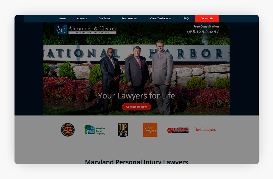
Navigation is an essential feature of your law firm’s website. It may seem obvious, but your website navigation is critical to user experiences as they look for content and features on your site. Navigation design is about creating a system that empowers website visitors to interact with your site and locate information, ultimately leading to more conversions.
The key to effective navigation is intuitiveness. An easy-to-use website leverages intuitive navigation. This means your website visitors should know exactly how to get around your website and find core information without confusion or frustration. All websites, especially law firm websites, should be designed to allow users to readily navigate the site and locate the info they are looking for. One of the most common design mistakes is only focusing on your website’s home page without considering how users will navigate to related pages.
Ready to build intuitive navigation?
1. Plan Your Hierarchical Structure: Utilize advanced planning to ensure you know the structure of your site before you start designing. You should clearly understand how your content and pages will be structured and organized. Don’t fall into the trap of focusing on only one page. Most importantly, develop this structure before you start designing.
You want to follow the three-click rule, a web design principle that suggests a user should be able to find any information on your website within three clicks. This helps ensure information is accessible to website visitors.
2. Remember the Basic Navigational Elements: Navigation is not limited to one element. Instead, several basic navigational elements improve user experiences that all lawyers should have in mind while designing their website: the main menu, secondary menus, sidebars, breadcrumbs, footer menus, and internal content linking. When designing each of these, remember that navigational menus work best when they are clear, short, and straightforward. Limit the number of options in your menu. Use short, concise names. Take advantage of categories and dropdowns.
3. Likewise, ensure your site’s design does not overpower your essential navigational elements. You want these to be noticed on your page. For instance, a minimalist design may incorporate navigational elements that are hard to spot or use. Be sure these things are visible to your visitors.
Best Practice 5: Remember Visual Hierarchy

Visual hierarchy, which refers to the organization and prioritization of content based on importance and relevance, is a crucial aspect of effective web design. Visual cues, including size, color, contrast, and placement, guide visitors’ attention to the most critical content on your web pages through a clear and logical information flow.
A well-organized and visually appealing hierarchy enhances user experiences and improves the effectiveness of your law firm website, while a poorly designed hierarchy is likely to confuse and frustrate users, increasing your bounce rates and decreasing engagement. When planning your law firm website, use these strategies to create a more effective visual hierarchy:
1. Consider Scale and Size: Large elements attract visitors’ eyes. Content and element sizing may seem like one of the most basic design elements of your law firm website, but the critical importance of sizing cannot be overstated. Increasing the scale of an element is one way to get more attention on that portion of your page, but enlarging certain elements too much can decrease the perceived importance of other details on the screen. Thus, exercising care and caution to strategically size and scale items is of the utmost importance during the design phase of a law firm site.
2. Carefully Pair Colors: Bright colors and good contrast attract attention and catch a user’s eye. Like scale and size, colors can also give importance to elements on your site. Design elements with good contrast also attract attention.
3. Spacing, Proximity, and White Space All Matter: Spacing and proximity of your elements create alignment. The alignment of elements on your law firm website helps users create associations between them. As users scan your web pages, spacing and proximity group similar content together and communicate importance. Moreover, the white space (or blank space) on your page surrounding elements is just as crucial as grouping the elements themselves.
Website visitors are likely to perceive closer together items as related. As users scan websites, they frequently use an F pattern, and you can use proximity and spacing principles to put key content in the path of their gaze.
Best Practice 6: Incorporate Elements to Promote Conversions

Your website has multiple audiences, including current clients, the community, and your professional colleagues. Nonetheless, new business often keeps a law firm afloat, and the most important website target audience is potential clients.
Optimizing your law firm website for conversions is crucial to turning visitors into potential clients and, ultimately, new clients. Adding conversion-increasing elements to your law firm website design can improve your overall conversion rate.
1. Take Advantage of CTA Buttons: Call-to-Action (CTA) buttons are one of the most common – and taken for granted – design elements of a law firm website. Your CTA buttons induce a website visitor to take a particular action.
The style of these buttons makes a huge difference. Use shape, color, and placement to ensure these CTAs stand out from other elements on the page. The color should stand out from your website background, and the buttons should be prominently placed on your page.
Also, you should take advantage of your button text to convey the value of clicking to your website visitors. “Contact Us” is a standard CTA, but you may have opportunities to make it even more engaging for your potential clients. For instance, if you offer free consultations, you could use “Schedule Free Consult” or similar text to connect with leads by encouraging them to take advantage of a benefit that may set your firm apart from your competitors.
2. Share Contact Information: Your law firm website will almost certainly incorporate a standard contact form, but what if your website visitor hesitates to fill it out or simply wants to speak with someone now? If you have contact information on your website, you set yourself up for more leads.
At a minimum, your website should have your office phone number listed prominently and your office location(s). You may also want to include a contact email – though many in the legal community debate this one, as lawyers often worry about spam in their professional inboxes. Ultimately, whether you include a contact email is up to you.
Best Practice 7: Use Engaging Images
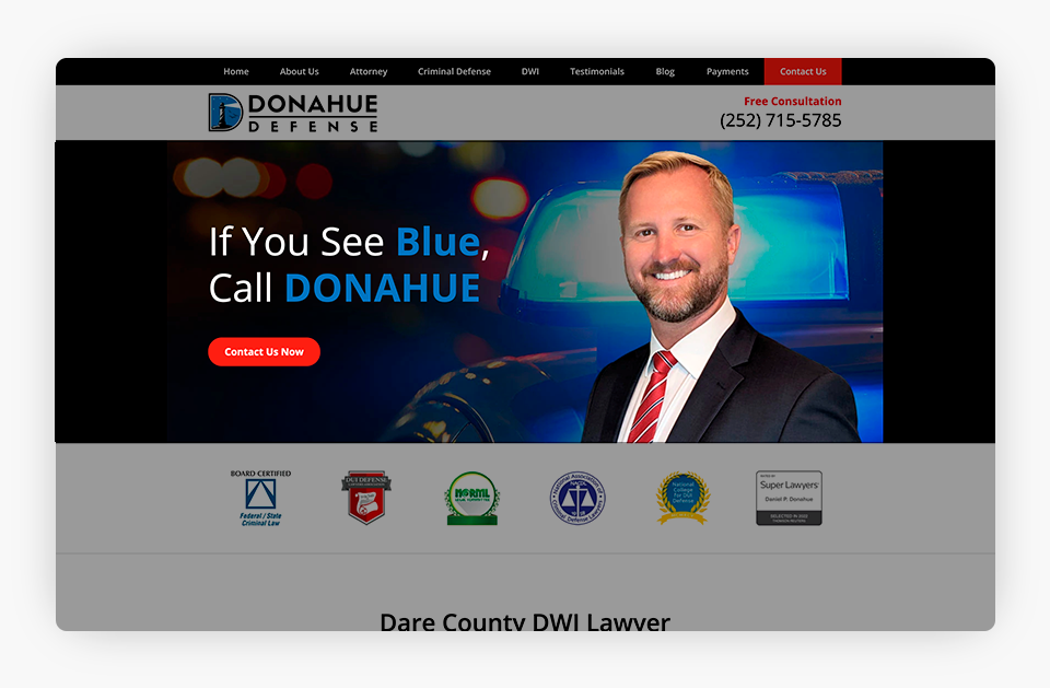
You have undoubtedly heard the expression, “A picture is worth a thousand words.” This adage is particularly true in marketing. The images on your law firm’s website play a prominent role in how visitors perceive your firm. Images can attract and engage visitors or turn them away instantly. When selecting your images:
1. Choose Images Aligned With Your Brand: The images on your law firm website should align with your brand. They should also be relevant to your messaging. You don’t want to use random stock photos on your site. Instead, carefully select emotion-invoking images that help bring your law firm’s culture to life.
2. Showcase Your People: Consider adding real pictures of the people behind your firm to your website and not just on your attorney bio pages. People tend to experience stronger connections with smiling faces. They like personable, authentic brands and companies. By showing your website visitors, the people behind your firm, you are helping create more genuine connections that can ultimately help your firm achieve its goals more quickly.
3. Select Your Header Image With Care: The header image, or hero image, is the first thing a visitor will see on your law firm’s website. It is arguably the most important visual you will integrate into your law firm website. It should be compelling and help you stand out from your competitors. It absolutely must be a high-quality image.
It is worth noting that your header image is also an excellent place for law firms to take advantage of number two: showcase your people. Photos of your team can build trust and encourage visitors to contact you when they land on your law firm’s website!
Best Practice 8: Stay True to Your Brand Identity

Creating a strong brand is vital to your law firm’s long-term success. Your brand gives your firm its distinct personality that stands out from your competitors. Your brand helps convey your law firm’s values and personality to clients past, present, and future, others in the legal profession, and your community. A powerful brand is often one of the strongest tools in your law firm’s marketing kit.
Brand consistency plays an integral role in creating a winning law firm brand, and your brand guidelines will influence your website design. Just a few ways your brand impacts your law firm website design include:
- Using Your Brand Color Scheme: Your website color scheme should be directly impacted by your brand’s palette. Brand identity is solidified through a consistent appearance, and your law firm website is no exception. Your primary brand colors should be prominent on your site. A mixture of your primary and secondary brand colors can be used to implement contrast, CTAs, and other visual elements discussed in this article.
- Incorporating Your Logo: Your law firm logo is a brand asset that instantly identifies your brand. Adding your logo to your law firm website (and other marketing materials) is crucial to creating brand recognition.
- Capturing Your Brand Voice: The phrase web design instantly invokes a visual connotation for many people. However, you cannot overlook the role of written content in your web design. Your written content communicates with your audience(s) in your law firm’s voice. Your design influences how people digest that voice. Your design can also highlight key messages and other written content.
Final Thoughts: Why Do You Care?
Your website is arguably your law firm’s most important digital marketing asset. When coupled with other digital strategies, a strong website propels your law firm forward for more growth opportunities.
Looking to refresh your law firm website for the remainder of 2023? Justia Elevate may be the perfect fit for you!
Our state-of-the-art platform integrates our team’s years of legal marketing expertise. Built on an efficient backend architecture for strong technical SEO, each Justia Elevate website for lawyers also leverages design best practices to help your law firm reach its full potential. Contact us to schedule a free, no-commitment consultation and learn what Justia Elevate can do for you.
Related Posts