We can’t send you updates from Justia Onward without your email.
Unsubscribe at any time.
Hi Friends, A recent study of eye movement by search marketing firms Enquiro and Did-it and eye tracking firm Eyetools shows that…… 1. Listings on the top of a search results page is viewed more...
Hi Friends,
A recent study of eye movement by search marketing firms Enquiro and Did-it and eye tracking firm Eyetools shows that……
1. Listings on the top of a search results page is viewed more than listings on the bottom of the Web page and
2. Being on the top of the editorial results or having a top AdWord placement is better than having a side AdWord placement.
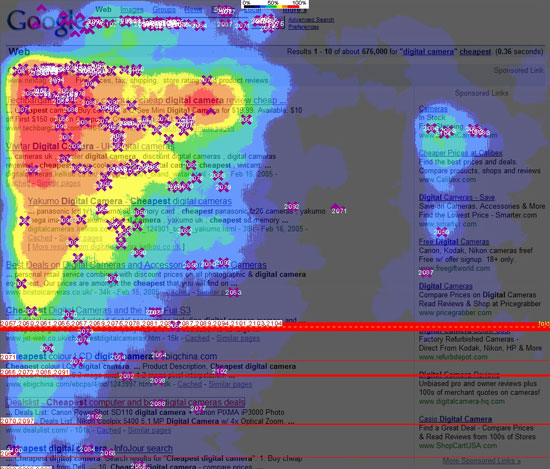
This graphic shows the eye movement of a participant in the study.
The Key Findings:
Organic (non-paid / not Google AdWords) Ranking Visibility – shown in a percentage of participants looking at a listing in this location. These are NOT click through rates.
Rank 1 – 100%
Rank 2 – 100%
Rank 3 – 100%
Rank 4 – 85% (above the fold)
Rank 5 – 60% (below the fold)
Rank 6 – 50%
Rank 7 – 50%
Rank 8 – 30%
Rank 9 – 30%
Rank 10 – 20%
Top Sponsored Ad (Google AdWords) Visibility were seen by 80 to 100% of participants (which indicates that some top ads were not seen, and thus are not as valuable as a top placement from an organic result listing).
Side Sponsored Ad (Google AdWords) Visibility – shown in percentage of participants looking at an ad in this location Again, these are NOT click through rates.
1 – 50%
2 – 40%
3 – 30%
4 – 20%
5 – 10%
6 – 10%
7 – 10%
8 – 10%
Okay maybe this is obvious for eye movement on Google search results… but think about how this might apply to your own law firm Web site. In particular look at the graphic above, and notice that the Google header is ignored, and the user looks right at the content, and starts in the upper left of the screen, and then scans to other blocks of content, in this case there being one on the right. One starting place on Web site usability at UseIt.com (among numerous other places on the Web). A good usability book, which will soon be out in a second edition this summer, is Don’t Make Me Think : A Common Sense Approach to the Web by Steve Krug.
Click here for the press release at Enquiro or Eyetools. And do a Google search on — Google “Eye Movement” — and you can find many discussions about the results of this study, positive and negative.
Great graphic!!! A good example about how to use a graphic to present information and get good pr. I am sure that this study has been a big win for all three companies.
Peace – Tim
![]() :: Louisiana Rain, Damn the Torpedoes by Tom Petty & The Heartbreakers
:: Louisiana Rain, Damn the Torpedoes by Tom Petty & The Heartbreakers

