We can’t send you updates from Justia Onward without your email.
Unsubscribe at any time.
While your law firm name is the first element of your brand that people come into contact with, your logo - the visual identity of your firm and name - is usually a close second. We’ve put together a list of various law firm logos to illustrate different styles and offer some inspiration for your next design.
Pause for a moment to think about a brand you know. What came to mind? Likely, you thought of the brand logo: the McDonald’s golden arches, the Apple apple, or the word Coca-Cola accompanied by the iconic wave.
As discussed in our previous post 6 Key Brand Assets Every Law Firm Should Consider Having, your law firm logo is one of the most fundamental elements of your brand identity because it gives a visual identity to your law firm. Your logo must stand out from the crowd and be easily identifiable. Ideally, your logo communicates your identity so strongly that future clients, other lawyers, and the public immediately associate this image with your firm.
Law firms may want their firm name to always be present in their logos to generate a strong connection with clients. However, you also want to ensure your logo is original, eye-catching, and communicates the values of your law firm. Even when you incorporate your firm’s full name into the logo design, there are plenty of ways to help it stand out.
For example, some logos utilize exclusively typographic designs. These logos are essentially the name of the firm. However, they are differentiated from others by the fonts and visual elements that you use. You can use a classic typeface, such as a serif, that brings in a serious and elegant feel, or you can use a more current and modern typeface to convey a fresh image. Other elements that can make a typographic logo stand out include mixing the firm name in a creative block, utilizing brilliant colors, and much more.
Alternatively, some logos use less traditional typographic elements, such as monograms and initials. This type of logo will become the formal symbol of the firm and is often complemented by the firm name. Initials commonly become the recognized name of a company. For instance, consider AT&T.
Some logos utilize an icon or element, rather than a standard typographic design to help them stand out. There are no rules about the type of icon or visual element you incorporate. It could be a symbol referring to your practice area or location. It could also be an abstract icon that makes the logo more striking.
Below we have compiled a list of law firm logos that are grouped by their different styles. Hopefully, one of these logos can inspire you when your firm decides it is time to create a new logo or refresh the existing one.
Typographic
These logos exclusively show the name of the law firm but the design, fonts, arrangement, and colors – among other factors – make them stand out.
Axiom

This logo uses modern typography and bright colors. The use of lower case adds a touch of freshness, and placing the letter “i” upside down is a subtle creative touch.
Stinson
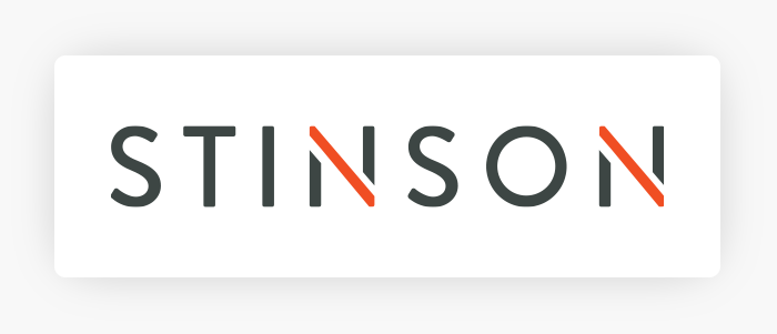
The Stinson logo utilizes a non-traditional typography that brings in a hint of modernity. Sober colors with the orange detail make it stand out to the eye. The diagonal lines are memorable and can be used across various materials to unify the brand.
Bona Law PC
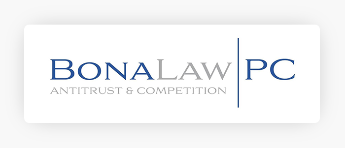
This logo is a classic serif typeface conveying seriousness and elegance. Two colors are used to separate the words and the relevant practice area is included for clarity.
Hogan Lovells

The logo utilizes a classic typography with stacked names for a more compact look. It is framed in a box with vibrant color that makes it stand out.
Cohen Milstein

The Cohen Milstein logo uses two colors to highlight the firm name. It is joined by a common feature between the letters “N” and “M”.
Monograms / Initials
The logos in this group use the initials of the firm names to create a graphic representation of the firm.
Bookoff McAndrews

This logo creates the law firm’s visual identity by utilizing an abbreviated version of the firm’s name. There is a mix of typographic styles – bold and regular – for a playful effect and the initials are stacked to maximize space. The full name of the firm is included in small print for clarity and impact.
McDonnell Boehnen Hulbert & Berghoff LLP

The lengthy firm name is shortened to MBHB to allow greater freedom in creating a logo. The lowercase letters and modern typeface bring a professional feel with an incorporated touch of modernity. The initials are placed in a framed box but with an open space that implies a sense of freedom.
Law Office of Matthew Vance, P.C.
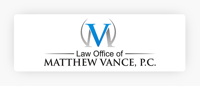
Thanks to the fact that these initials have similar features and angles, this logo is the perfect integration of two initials into a single monogram. The “V” initially stands out, but upon second glance, the “M” is revealed.
Bernstein Litowitz Berger & Grossmann LLP
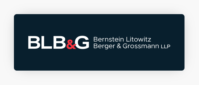
This is another example of utilizing initials to create a shortened version of a long firm name. Uppercase typography gives the logo a strong weight and the color details on the ampersand stand out. To a lesser extent, the full name is present and can be easily omitted if there are spacing concerns.
Osborne Clarke
At first glance, it seems that two geometric shapes were used in this logo, but an in-depth look reveals that the initials of the firm name are given an appealing visual treatment to create the graphic. Keeping the logo and name in a block helps make things more compact.
Legal Theme Icons
These logos use well-identified symbols that connect with the legal field: the judge’s gavel, scales of justice, the Supreme Court, columns, and fountain pens. While these visual elements can work well, they are also common which makes it more difficult to achieve an iconic logo. If you choose to use an icon in your logo, you should adapt the elements to create your own identity.
Hewette Guyton Gareis

This logo uses a subtle combination of the iconic scales of justice with what appears to be a sword. Swords are an element frequently seen with Lady Justice.
Edward J. Kone, P.A.
If you choose to use well-known icons in your logos, you do not necessarily need to use the whole image. For instance, in this logo, the firm only used a portion of the scales of justice, but the image and meaning are immediately recognizable.
Barrett Tax Law

A column, which is frequently considered in connection with the Supreme Court, is integrated into this firm logo. The first initial of the firm is used to customize the image and the partial symbol calls the full imagery into the viewer’s mind.
Non-Legal Theme Icons
These logos use geometric figures and abstract icons that do not necessarily have a direct connection to the legal world. These icons give more creative freedom to the design process. In general, these icons can be integrated into various corporate materials and communications collateral to unify and strengthen the firm’s identity.
Harrity LLP

You can see the name of the law firm in this logo preceded by what appears to be a stylized sphere. But when you look more carefully, you can see an “H” forming, which connects to the first letter of the firm name.
Orrick

The ring in this logo is designed to look like it is in motion, thanks to the stylized edges and color gradients. The inspiration for this circle is the “O” in the name of the law firm.
Womble Bond Dickinson
The iconic circles attached to the name make the logo more dynamic and gives it a sense of movement. The harmonious combination of colors creates an appealing visual aesthetic.
Rivera Law Office
The graphic in this logo is a soldier in an attack position. This symbolic image implies the law firm fights for justice and its clients.
Practice Area
Each of the logos in this group, whether they use icons, monograms, or standard typography, clearly identifies the firm’s specialized practice area(s).
Hayes Wakayama
This logo creates an identity around the law firm’s specialty: DUI matters. At a glance and without any further research, it is clear that this firm specializes in driving under the influence cases.
Lipcon, Margulies & Winkleman, P.A.
This logo is rooted in a typographic style supported by a symbol or icon. The anchor symbol makes it clear that the firm’s specialty is Maritime & Admiralty Law.
Location
Location-based logos include elements or characteristics that refer to the city or region in which the law firm operates. These logos may incorporate well-known landscapes, famous buildings, or even silhouettes of the states where the lawyers are licensed.
The Vegas Lawyers
The brand name of this law firm is clear and the logo’s imagery only reinforces it. A neon light treatment, similar to the lights found on “The Strip”, a casino table, and the “G” that borrows imagery from a roulette wheel all connect this law firm to Las Vegas.
Final Thoughts: Why Do You Care?
As discussed in prior posts, your law firm logo is one of your most important brand elements. You need to take great care in creating your logo because it will become the visual representation of your firm, your way of working, and your values.
There are no firm rules for creating your logo, but it is important to always consider fundamental elements like readability, timeliness, memorability, and visual aesthetic. For instance, a logo with many elements may look great on a sign, but what about when it is used in a small format on a business card? Those numerous, cool elements may become more of a distraction.
To ensure you have a strong logo for your firm, consult with a graphic design professional to create something high-quality that will continue to work for your practice in the years to come.