We can’t send you updates from Justia Onward without your email.
Unsubscribe at any time.
Read about how lawyers and law firms can transform their Internet marketing efforts into a top-notch, effective website. Some of these tips are intended to make your site easy to use on multiple devices, from computers to tablets to mobile phones. Others are basic tips regarding functionality and design. A must-read for lawyers with websites.
Common sense tells us and substantial research has proven that first impressions have a big impact. In our digital era websites are frequently the first opportunity a law firm has to make an impression on a prospective client, opposing counsel or a judge. The way the site is designed also has a large influence on conversion rates, e.g. the number of people that actually take action once they arrive on the site. These are important reasons to have a strong website design. In the old days physical law firm offices used to create the first impression so firms were compelled to invest in expensive furniture to give clients confidence and create an ambiance. A wonderful aspect of the Internet is that you can create a great looking site and first impression even if you have a small office or are just starting out. The following are six essential best practices in law firm website design.
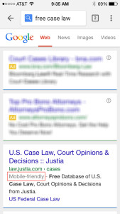
1. Make sure your site is mobile friendly.
Mobile usage has surpassed desktop in search queries and Google has indicated that they began using mobile-friendliness as a ranking signal in April. You can check to see if your site is mobile friendly here. If your site is not mobile friendly, ask your webmaster to bring it into mobile compliance.
2. If you haven’t already, get a responsive design.
Responsive design is a design approach recommended by Google and aimed at crafting sites to provide an optimal viewing experience—easy reading and navigation with a minimum of resizing, panning, and scrolling—across a wide range of devices. You can check to see if your design is responsive by grabbing the bottom of the browser window and adjusting the size to see if the design adjusts so you don’t have to pan sideways. You will be able to see what it looks like on various different size devices by growing and shrinking the browser window. You can try this on the Justia.com home page. If your design has been online for a number of years it may not be responsive yet. Check with your provider for an upgrade if your site is not yet responsive.
3. Make your site easy to read.
Is your font big enough? Many sites use small type which may look elegant but is hard to read and less user friendly. Another common issue that makes the font difficult to read is light words on a dark background. It easier to read a site that contains a dark text on a lighter background. You can still use a dark header or background if you’d like but the text on the page will be far more user friendly if the body of the text is dark on a lighter background with enough contrast.
4. Make your site easy to navigate.
Are important elements in the navigation? Can you find the home page from any page on the site? Having consistent navigation throughout the site makes it easier for the users so they don’t need to constantly reorient. If you have a lot of content on the site, you might consider a site search. However, most law firms don’t have that much content, and the site search can distract people from other important elements on the site.
5. Make it easy to contact you.
Make sure it’s easy to find contact information and offer different modalities to give options to clients. Include your phone number, office address(es) and a link to an email address on each page of the site. You can obscure the email address to minimize spam. Including a contact form on each page of the site will improve your conversion rates. We recommend putting your phone number above the fold, and having the contact form higher on the page will improve conversion rates. We also recommend linking your social media on the site so visitors are given the opportunity to follow you there.
6. Include calls to action.
Calls to action, such as “Contact us today” or “Call us for a free consultation” improve conversion rates. Using live chat can also improve conversion rates. Some law firms, especially those that cater to businesses, prefer a more understated approach without explicit calls to action. That is not a problem, but having the explicit calls to action will improve the conversion rates.
In essence, your marketing should cater to your audience, and these recommendations are all about that.
