We can’t send you updates from Justia Onward without your email.
Unsubscribe at any time.
The year 2020 was packed with new trends full of creativity and innovation in web design. While some will fade away, others are definitely here to stay. Most of these trends were distinguished by attaining a perfect balance between a responsible design (which cares about usability and accessibility features) and a daring design that is very attractive to the visitor. Here is a list of some of these trends for your analysis and inspiration.
Have you noticed how most websites on the Internet look more and more alike every day? You are not the only one who noticed it. This is a characteristic of web design in 2020. This is mainly due to design patterns that have been standardized over the years and the boom of code libraries as well as content management systems (CMS) that strive to ease website development in a simpler and faster way. Although some people might see this as a limitation, it has contributed to greater adoption and use of technology by offering an intuitive experience to all users, no matter which website they are visiting.
However, this posed a challenge to designers and businesses: how to make a website stand out in an increasingly homogenous web world without affecting the overall user experience? As a result, designers proposed and explored new design trends in 2020 to accomplish this purpose. All of this becomes more relevant in the current context, where the pandemic has driven more businesses to have a more relevant digital presence every day.
To celebrate the end of 2020, we took on the task of selecting the web design trends that marked this year and some others that we foresee in 2021. Below, we share these trends, along with examples and images.
Popular Web Design Trends in 2020
Although some trends were not completely new, 2020 was their year of consolidation. Other trends were completely new and became industry standards this year. Several of these trends had a clear inspiration in the user experience on mobile devices. In other cases, the designer simply made clever use of design elements, such as the color palette, graphics, or typography, to attain a more attractive and novel look for the user, thus drawing their attention.
Trends That Are Here to Stay
The following trends strengthened their popularity this year, so we believe that they will last longer.
Minimalist Design
Minimalism is a design approach that eases the user’s flow through a website or app due to its abundance of negative space and simplicity over its layout. This trend has proven its purpose to improve usability by keeping elements to a minimum in order not to overload a web page with unnecessary information and options.
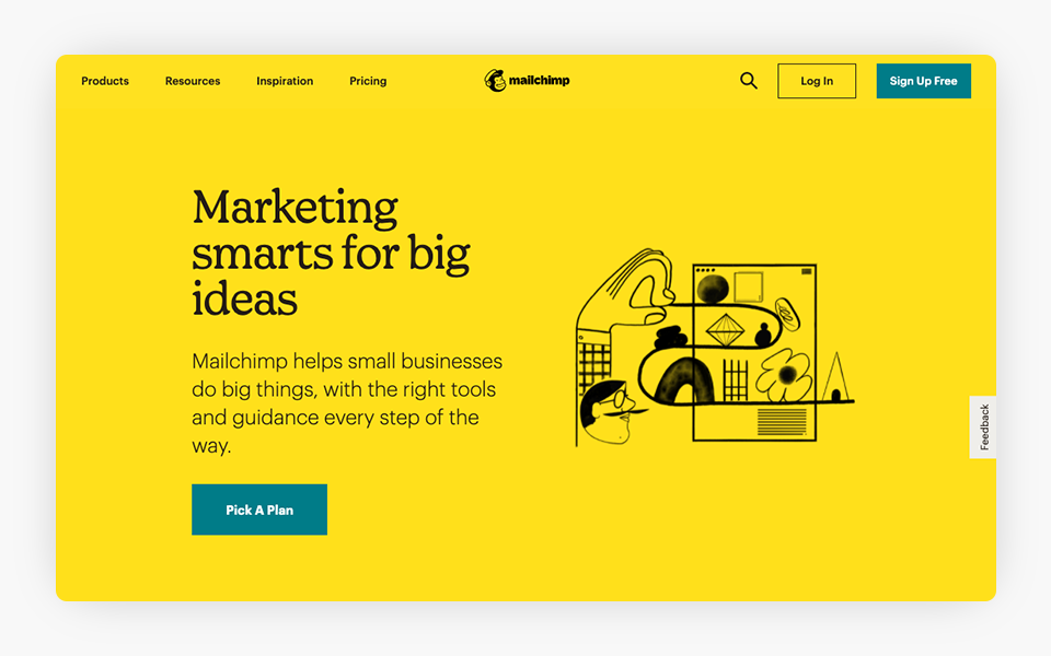
The Mailchimp website is a good example of minimalist design. You do not have many elements on the page header, and it has a simple one-color background. The negative space serves to manipulate the user’s visual flow.
“Less is more” is the most suitable watchword for this movement, for which its clean and even design makes this style get the popularity that it deserves. The minimalist design makes things easier to locate as a result of the strategic arrangement of elements. For instance, common practices such as hiding a navigation menu into a hamburger menu turn out to be beneficial when displaying websites on mobile devices.
Modular Web Design
More than a design trend, this is about a new way of designing and building websites. Under this approach, the design of a website is made up of a set of reusable blocks. The use of blocks (also called ‘boxes’) allows organizing a website’s content logically. Aesthetically, this visual trend is optimal to add symmetry and balance to web design. Also, the user can ‘scan’ the information more easily.
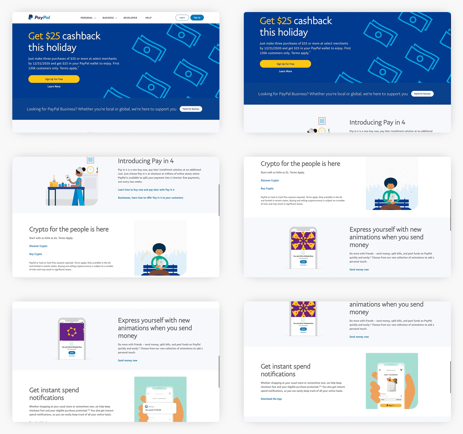
The home page of the PayPal website has a grid and section layout. Every section is clearly delineated. Modular design is the way that modern websites are designed and built nowadays.
Modular web design focuses on the parts of a web page and then combining these parts into a whole web page, rather than considering a web page as a unique page unto itself. This approach provides the developers with the advantage of focusing on designing these parts, and then providing the user with the final page design permutations offered by combining those parts into a whole. This whole allows producing an effective website design that is compliant with the best practices in a shorter period of time, and brings a consistency between pages. We see a similar approach in many popular web design platforms today.
Design Trends Influenced by User Experience on Mobile Devices
We can confidently predict that trends influenced by user experience on mobile devices will remain in the digital world, not only because they are avant-garde but also because of their multiple advantages in terms of accessibility and mobile-first thinking.
Dark Mode
Who hasn’t heard people complain about how tired their eyesight is by the end of a workday? The glare from electronic device screens can be harmful to our eyes. The dark mode was born as a solution to eye strain in 2018 and became an essential accessibility tool throughout 2020. Dark mode in web design consists of a color palette that uses light-colored text, icons, and other graphic elements on a dark (usually black) background. This type of color palette offers an elegant alternative for certain types of websites, in addition to the already known benefits.
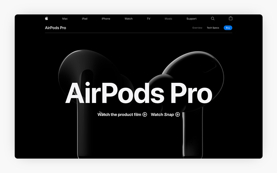
Apple added dark mode to its iOS and MacOS operating systems. Thus, it is not a coincidence that some of its websites have a dark look (white text on a dark background) as well. For example, check out the AirPods Pro page in Apple’s official website.
Digital reading devices were among the first to use this feature within the contrast adjustment options. Google, Apple, Microsoft, and Facebook implemented dark mode in several of their mobile applications and themes to provide a better user experience. The most popular messaging client, WhatsApp, a Facebook-owned service, enabled dark mode for iOS and Android devices. Although it is possible to implement dark mode with a theme (CSS code), most browsers offer a built-in CSS-override dark mode for websites.
Non-Traditional Scrolling
Maintaining a user’s attention on a static and simple website is difficult to achieve. When a user moves around a website, he is not only browsing but also interacting, and becoming involved in what is going on within the website. The more time that the user spends on this exchange, the more evident it is that the website has awakened interest. One way to increase the level of attention and interactivity is by using different scrolling styles from the more traditional way (i.e., vertical scrolling). Some forms of ‘non-traditional’ scrolling are:
- Dynamic scrolling. Although the scrolling style is kept vertical, you can add dynamism to the site, either with some static object while the background is scrolling or with the gradual appearance of some graphic elements with subtle animations, such as changing background color as the user scrolls through the sections. These effects help the user have a good experience when navigating, wake up their interest, and receive the key information that you want to pass on more directly. Here is an example of this type of scrolling.
- Parallax scrolling. This type of effect precedes dynamic displacement. Although it is not a new trend, there is no doubt that this kind of interaction has come to stay. This effect consists of moving the background of a web page (which usually consists of an image) at a slower pace than the elements at the front (for example, text) that appear on the screen. The parallax effect gives the user a sense of depth. This 3D visual effect, within a somewhat static website, fulfills the function of retaining the user’s attention. Click here to see an example of parallax scrolling.
- Horizontal scrolling. While it is a simple and functional form of scrolling, the horizontal scrolling ‘breaks’ in the good sense, with the vertical flow catching the user’s attention by scrolling horizontally. Besides, this form of scrolling turns out to be very natural and comfortable to navigate on mobile devices. Here is an example of this type of scrolling.
Trends for a Modern Look Design
Some of these trends arise in response to the flat design and ultra-minimalist approach (e.g., the use of monochromatic color palettes) that were in fashion in previous years. If your goal is to change your website’s look to a more contemporary and up-to-date one, consider the following 2020 trends for a successful outcome.
Vibrant Colors and Gradient Design
With the arrival of the minimalist trend in websites, there was a time when solid colors or a black and white palette was widely used. However, even when this is not a bad design decision, the new generations might perceive those websites as old-fashioned, boring, and repetitive. Therefore, today’s trend is to use vibrant colors and color gradients that provide a sense of modernity and visual impact that are highly perceived by the user.
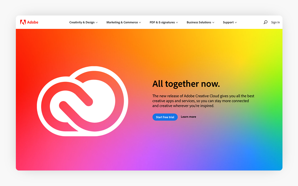
The Adobe suite is the favorite for the majority of web designers. Thus, Adobe always makes sure to stay current on top web design trends. As you would expect, the Adobe website is full of gradients with vibrant colors.
Bold Typography
Typographic fonts were once just a text element but are now often overtaking images as the main design element. In 2020, web designers turned to typography to attract users’ attention through big fonts and vibrant colors. This allows highlighting the most important elements of the content, such as the title or headings, to achieve a greater impact, thus conveying the website message more effectively.
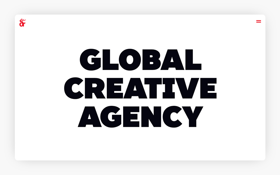
Pushing the boundaries is nothing new in marketing. The websites of marketing agencies are usually more visually appealing than traditional websites. The website of this marketing agency uses large fonts to attract attention and reinforce their message.
Creative Illustrations
Sometimes a photograph by itself is not able to convey the full message to the user. As an alternative to the photograph, an illustration or a mixture of both can be used. The illustration can evoke feelings of warmth. If illustrations are created exclusively for your website, they can also help to give it a unique look, as well as to incorporate the visual elements of your brand into your website. An illustration can be used as the main image and in smaller elements such as icons.
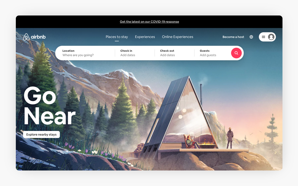
The COVID-19 pandemic had a huge impact on Airbnb. However, Airbnb is adapting to the new normal. Among the changes that they implemented, they redesigned their website to make it more appealing to people looking for a different experience (short-distance travel). The illustrations give the website a warm touch.
Asymmetric Design
Asymmetric compositions used to stir some controversy among designers because they did not follow the normal structure canons; today, they suggest a different view of the web pages that use them. Unlike traditional web design, which is symmetrical (i.e., there is a balance between both sides, where many elements are perfectly aligned with each other), asymmetrical design breaks this balance and harmony by incorporating floating blocks and overlapping elements. The result can be attractive and daring for the user.
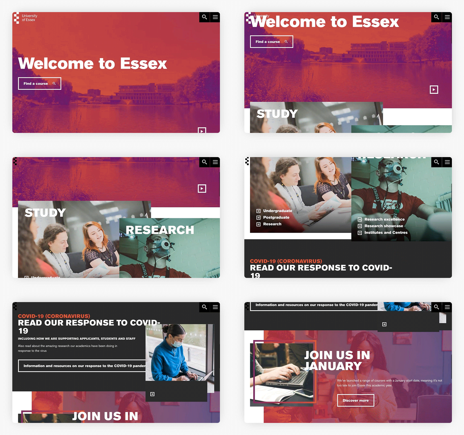
Although the layout of most university websites is simple, some find the perfect balance between usability and aesthetic elements. The website of the University of Essex is really eye-catching, with several overlapping elements on its home page.
Web Design in Motion
Motion has always been an effective tool to attract the users’ attention. However, implementing motion into a website design was not highly recommended back in the day due to its web performance cost (in other words, it made your website slow). It was even counterproductive because a certain amount of loading time had to pass before it could be seen in operation, driving the user away. This has changed with more modern browsers and animation techniques that allow executing any animation type in a more efficient and almost instantaneous way.
Scrolling does not necessarily have to be the first point of interaction between the user and the website. From the moment when the user accesses the website, subtle animations can be presented in the main image, a simple slider, a blinking contact button, a background video, etc. The correct use of some elements that convey a sense of movement in the website increases the chance that the user has a good experience and therefore decides to stay longer.
Some elements that can be used to provide your website with movement are:
- Video background. A video in the background, if used properly, can help capture the user’s attention. We see this trend mainly in the headers of websites with a video running in the background. A video allows you to convey your company’s message more effectively when a static image is not enough. Also, it allows you to set the right tone for the rest of the content on your website. Mastercard uses video background on its website.
- Animation. Animation can positively influence the perception of users regarding your website. Animation can be both entertaining and informative. Therefore, it makes sense to invest time in making animation interesting and attractive. An example might be an animation when the page is loading or while users are browsing the website’s content. Users can have fun watching the animation while the content is being displayed, which also improves their experience on the website. The website of the Robinhood app has an animated graphic on the website header to give the visitors a fun and memorable experience.
- Micro-interactions. The purpose of micro-interactions is to help the user while interacting with the website entertainingly. These micro-interactions involve giving hints and information on how to correctly use the website (from indicating which data is missing from a form to showing the progress of a download). Micro-interactions mainly consist of the animation of user interface elements to drive the user’s attention to a particular element. In general, a site with good micro-interactions is more emotional and humane, and it offers a better user experience. This Google Photos page takes micro-interactions to the next level.
What to Expect in 2021
Although we expect to see some of the above trends next year, we know that the web is constantly changing and evolving. Customers’ tastes, user needs, and technology change. If we want to keep the look of our website up to date, we must move faster to ensure that we are not left behind.
In addition to the above-mentioned trends, which will surely continue, some aspects will become more relevant in the coming year, such as:
Inclusive and Accessible Web Design
This means that each web page is designed and coded in a way that makes it accessible, usable, understandable, and easy to navigate for users with physical and mental disabilities of any kind so that more people can be reached. Web accessibility is required by law today. We expect that formal ADA standards for websites, with safe harbor requirements, will come from the US federal government sometime in 2021 or 2022 from the new Biden administration.
Organic Design
Although it may not be suitable for all businesses, a design inspired by nature (organic textures, warm colors, and natural shapes) is undoubtedly more commonly searched by users seeking online contact with the feelings that they get from being in nature (especially in the middle of the pandemic, it can be a relief compared to sites with a colder business look). A website with some of these features can make the user feel comfortable and relaxed.
Emoji Design
With the need to communicate more quickly and effectively, the so-called emojis emerged. The emojis manage to transmit emotions and connect at that level with the users. Websites can take advantage of this type of widely recognized image to make the interaction more pleasant and enjoyable. The user will sense that he is welcome and will be able to transmit his current state of emotions better when selecting options. A site with this type of design has the advantage that it can be more attractive to new generations.
3D Design
We will see more 3D elements on websites (from 3D buttons to 3D models). 3D design is not new, but thanks to technological advances that allow users to interact with 3D contents, it will become more popular. This type of design will make your website stand out from the rest and encourage users to engage in different ways. We will surely see many new features with this type of design in 2021.
Summary
2020 was a very interesting year in the world of web design. As mentioned, some trends coming from previous years consolidated in this year. On the other hand, in the continuous desire to innovate and stand out, in some cases, designers presented many proposals and innovative trends full of creativity beyond the limits. It is worth noting that the world of web design was also characterized by an increasingly close collaboration between designers and developers, in which each trend was carefully proposed, always looking out for the best practices and standards concerning usability, accessibility, and web performance.
Nothing is carved into stone. Something that we learned in 2020 is that things can change from one day to another. Web design is no exception; it is in continuous change and evolution. The trends presented here are meant to inspire, guide you in the right direction, and be discussed, tested, and/or discarded if you are not convinced. In any case, 2021 will have plenty of news in the world of web design.