We can’t send you updates from Justia Onward without your email.
Unsubscribe at any time.
You worked hard, and your SEO strategy is doing its job. People are visiting your law firm's website, but what if that traffic isn’t translating into more clients? Here are six factors that will influence your law firm website’s conversion rates.
Getting website visitors is only a part of the battle in a competitive legal marketing world. While you certainly want to increase law firm website traffic, you also want to turn those website visitors into clients. Simply put, converting your website visitors into new clients is crucial for law firm growth.
Wondering why an increase in website visitors isn’t correlating to a rise in clients? In this blog post, we’re diving into six key factors that influence your website’s success rate of turning visitors into leads.
1. Design: Professional and Visually Appealing
You dress professionally for court to put your best foot forward with the judge, opposing counsel, and the parties. It is about how you are perceived and represent your law firm’s image. Your website design works much in the same way.
Outdated or unappealing designs create negative impressions. They may also deter potential clients or make them question your law firm’s credibility. Additionally, the design should look good on all screen sizes, including desktop and mobile.
Desktop

The website example in the screenshot highlights some important design elements that will help maximize your conversions:
- The website has contrasting colors for the calls to action (e.g. the red Free Consultation, Call 24/7, and Contact Us buttons) so that these elements will stand out to users, making it more likely for them to convert.
- The attorney photos create a great first impression for site visitors and can help establish a sense of trust.
Mobile

- Additionally, the responsive design provides an optimal viewing experience—easy reading and navigation with a minimum of resizing, panning, and scrolling—across a wide range of devices, including mobile phones.
Key Takeaway
Invest in a modern, visually appealing website design that aligns with your brand. Be sure it is mobile-responsive and follows all best practices. Once you have a professional, visually appealing site, your chances of converting visitors increase exponentially.
2. Establish Credibility: Provide Social Proof and Showcase Your Credentials
Would you hire a contractor for a major renovation project without reviewing any references, reviews, or credentials? Probably not. You would be worried about the risk. Your potential clients are unfamiliar with the law and likely feel the same about your practice. Therefore, including credibility-building elements on your website is crucial for long-term success.
Below are some examples of how to successfully leverage your accomplishments as marketing collateral for your law firm website.
Case Results and Badges Strips
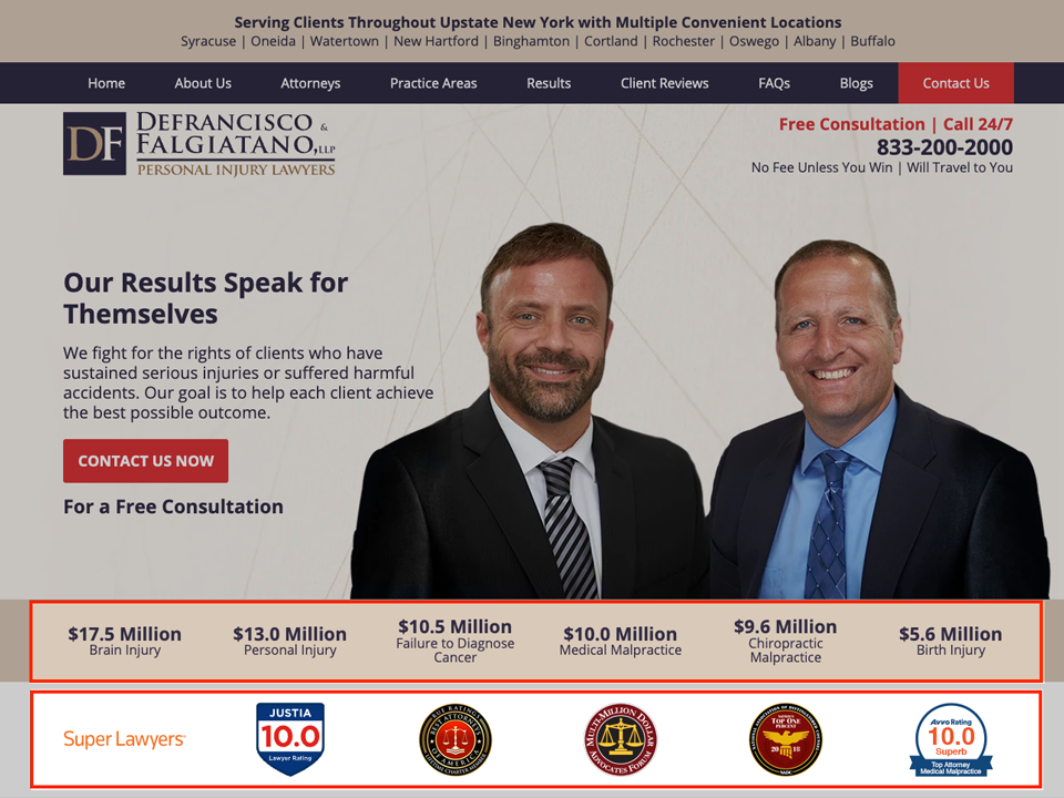
- The case results strip and badges strip highlight impressive firm achievements.
- Leverage badges for awards and associations as marketing collateral for your firm.
- Note: If you don’t yet have awards and accolades, you can include state bar associations and free badges such as the Justia Lawyer Rating Badge or Avvo Rating badges.
Client Reviews
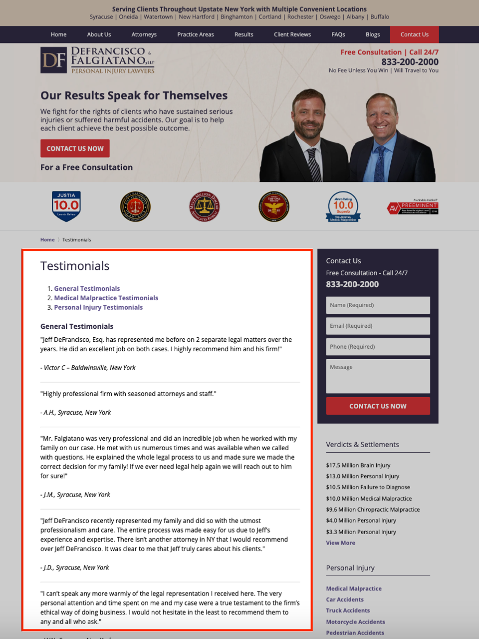
- The client reviews provide further social proof. Site visitors place great value in the reviews they read online.
Verdicts & Settlements

- The Verdicts & Settlements page provides additional details on the firm’s results, further establishing the attorneys’ expertise.
Key Takeaway
Display client reviews, case results, and professional credentials prominently on your law firm website. Also, link over to your social media profiles, where community engagement can function as a means of amplifying social proof.
3. Inclusivity: Make Your Website Accessible
People are diverse, and your law firm likely serves a diverse clientele, including people with disabilities. An inaccessible website exposes you to legal risks and excludes potential clients who may need your services the most.
While we’ve already written extensively about accessibility for websites, we’ll recap a few of the main points:
- ADA Standards for Accessible Design is a law that protects people with disabilities
- ADA compliance is required for your website if your law firm is open to, and provides services to, the public.
- The WCAG 2.1 AA is the technical standard used by many entities to make websites accessible, including the State of California.
There are several tools that can be used for accessibility audits, one of which is Google PageSpeed Insights. This tool can help developers identify accessibility issues. Another more specialized tool is the WAVE Web Accessibility Evaluation Tool, which offers more detailed information and suggestions.
Watch this clip to learn more about website accessibility and the ADA.
Google PageSpeed Insights Accessibility Audit
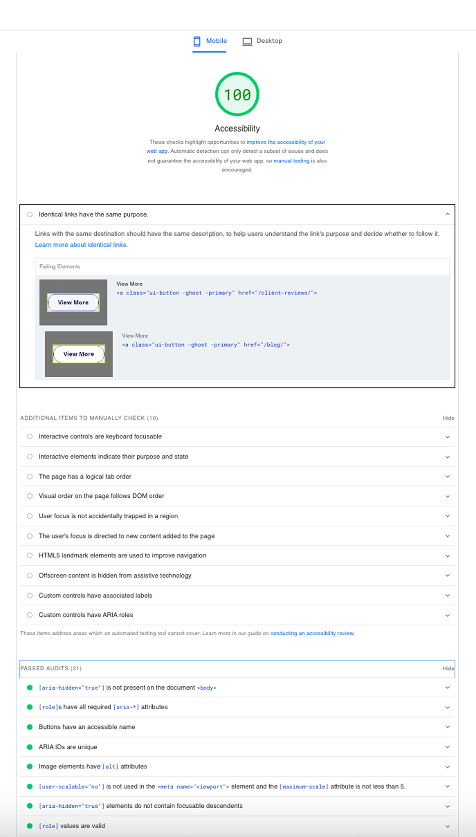
- Google PageSpeed Insights includes Accessibility audits. As you can see in the screenshot above, the site doesn’t have any issues detected and passes the accessibility audits.
Key Takeaway
Conform to accepted web accessibility standards and be cognizant of the applicable accessibility laws. Implement alt text for your images, utilize proper heading structures, and ensure a keyboard can navigate your site. By making your website more accessible, you demonstrate a strong commitment to inclusivity and improve your chances of converting website visitors into new client leads.
4. User Experience: Usability and User Journey
User experiences (UX) are like the digital equivalent of ensuring your trial binder is well organized. If you are unable to find critical pieces of evidence, you are less likely to have success at trial. Likewise, if your law firm website is confusing, cluttered, or challenging for visitors to navigate, they are less likely to convert. Also, remember that a website that passes accessibility audits doesn’t necessarily ensure a good user experience. It’s possible to pass accessibility checks and still have a poor user experience.
Usability
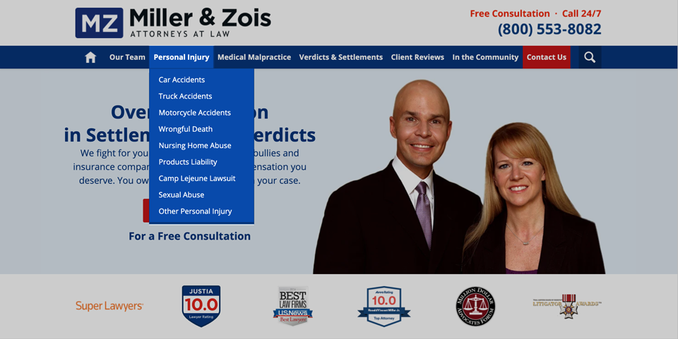
- Keep your drop-down menu items manageable (i.e. don’t include too many items and keep titles as concise as possible).
- This will make it easier for users to find the information they want. We recommend avoiding complicated drop-downs with flyout menus as they tend to be difficult for users to navigate and take up a lot of space.
- Note: If you have a long drop-down menu, you should prioritize your list and consider adding “View More” as the last item in the menu where users can click to see a full list of the items. In the example above, they used “Other Personal Injury”.
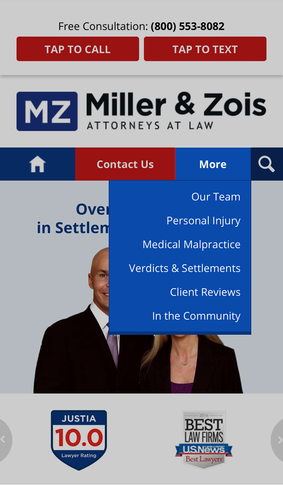
- The top navigation bar should be clean and easy to use on mobile as well. Showing only the top-level items on mobile helps to keep the list concise.
User Journey
Below is a screenshot from Google Analytics 4 (GA4) showing the user journey for various Justia portals. We’ve expanded the first node to show the user journey starting from www.justia.com, ultimately arriving at a lawyer directory profile on lawyers.justia.com.
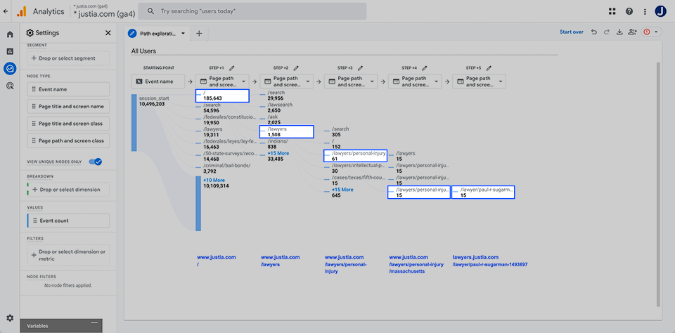
Here’s the user journey illustrated in the screenshot above:
www.justia.com/ > www.justia.com/lawyers > www.justia.com/lawyers/personal-injury > www.justia.com/lawyers/personal-injury/massachusetts > lawyers.justia.com/lawyer/paul-r-sugarman-1493697
In addition to being easy to navigate, your website also needs to be optimized on the backend. If you don’t rank well in the search engines, it will be harder for people to find your site in the first place.
Core Web Vitals
For organic search ranking purposes, Google cares about Core Web Vitals, which uses real data from real users. If the website has Accelerated Mobile Pages (AMP), Google focuses on AMP when analyzing the mobile pages. That said, it is best if the AMP, mobile, and desktop pages all pass Core Web Vitals. Core Web Vitals are not as important for low-traffic websites, where Google does not have enough data to really analyze the website or webpage. Core Web Vitals uses real data from real users and is updated periodically, but not each visit to the webpage.
Watch this clip to learn more about Core Web Vitals.
Google PageSpeed Insights Diagnosis tools
The Google PageSpeed Insights diagnosis tools aim to give suggestions to improve your website from a technical optimization standpoint for real users. While the tools are not perfect, the key value of the diagnosis tools is the suggestions, not the scores.
Also, the performance diagnosis suggestions and scores are snapshots in time; they may/will change each time you test a page, unlike Core Web Vitals, which uses real data from real users and is updated periodically, but not each visit to the webpage.
Below is a screenshot from Google PageSpeed Insights.
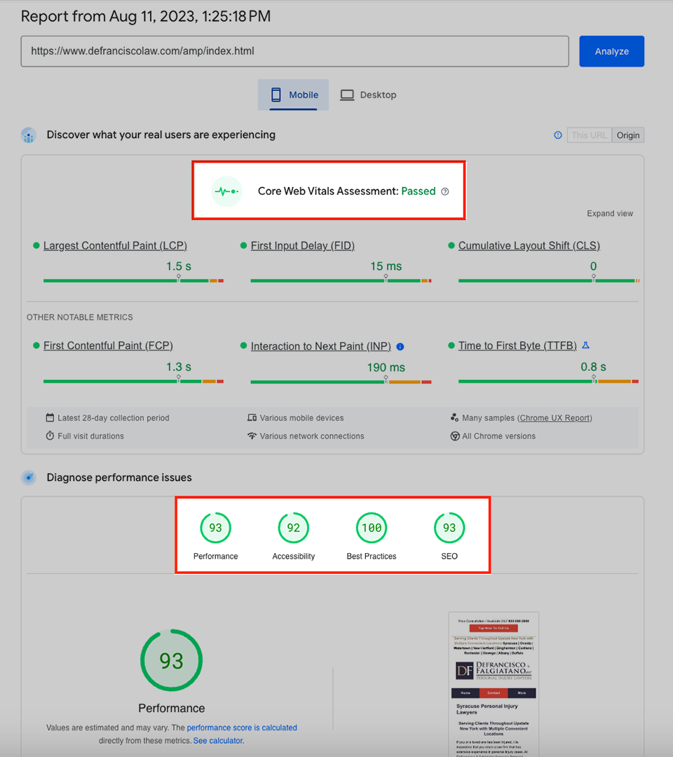
- Core Web Vitals Assessment passed, which is an important ranking factor. The report shows how your pages perform based on real-world usage data.
- High scores for performance, accessibility, best practices, and SEO.
- Creating Accelerated Mobile Pages (AMP) for your website, which load almost instantaneously, can significantly improve your mobile performance.
Key Takeaway
Ensure your law firm website is user-friendly, with intuitive navigation and a clear user journey from the second they land on your homepage until the moment they choose to contact your firm. A seamless user experience increases the likelihood that visitors will ultimately reach out to your firm. Additionally, you should optimize your website performance by choosing a reliable hosting provider, leveraging browser caching options, optimizing images, and focusing on mobile-user experiences. On a technical SEO level, the backend coding and architecture of the website are also vital to achieving a fast and fully optimized website. A faster website leads to fewer frustrated visitors and increases your chances of turning website traffic into new business. As mentioned, Accelerated Mobile Pages (AMP) can significantly improve the mobile performance of your website.
5. Content: Create Engaging, Relevant Pages
High-quality, persuasive, helpful content is the backbone of your law firm website and is essential for organic visibility. It’s not just about explaining your services. You need to demonstrate knowledge and offer helpful information. Your job is to convince your website visitors that your law firm is the right choice for them. Unhelpful, dry, or uninspiring content won’t cut it. Google has rolled out numerous helpful content algorithm updates as part of an “ongoing effort to reduce low-quality content and make it easier to find content that feels authentic and useful in search.” When developing content for your website, keep in mind that the end goal is to make content that is helpful for humans as opposed to writing spammy content solely for the purpose of ranking.
Personal Injury Content
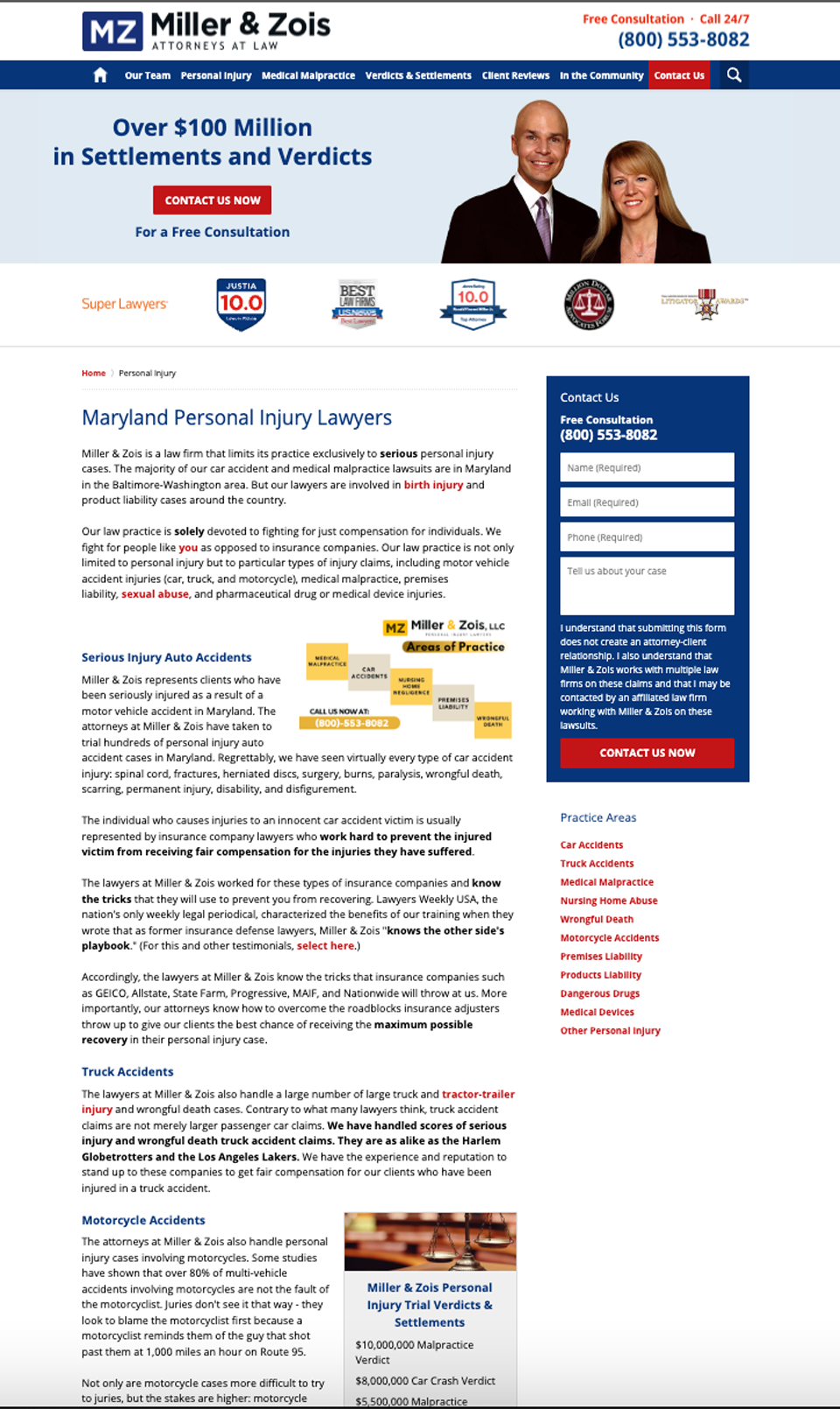
- High-quality, original, legally substantive content is likely to be helpful to your website visitors and can benefit your search engine optimization.
Watch this clip to learn more about creating high-quality legal content.
Key Takeaway
Create engaging, original, and informative content that addresses your potential clients’ pain points and offers valuable insights and analysis into the law and services you provide. Incorporate SEO best practices and use keywords and language designed to resonate with your target audience and compellingly showcase your expertise.
If you have difficulty finding the time to write content, you could consider using an AI tool, such as ChatGPT, though you need to review the accuracy of the content before posting it online. Google is not opposed to AI-generated content. In fact, per the following article, Google has stated that “however content is produced, those seeking success in Google Search should be looking to produce original, high-quality, people-first content demonstrating qualities E-E-A-T [expertise, experience, authoritativeness, trustworthiness].” For more information on how to take advantage of ChatGPT, you can watch our video below:
Watch this video to learn about using ChatGPT and AI tools for legal content writing.
6. The Conversion Path: Contacting You
Contacting your law firm should be your website’s easiest action. If potential clients have to jump through hoops to find a way to reach your practice, they will likely give up before they even start. The conversion path should be as smooth as possible, leading website visitors seamlessly from interest to action. This goes hand-in-hand with creating positive user experiences.
Desktop

- The sticky header has a clear call to action above the phone number, and there are two convenient contact buttons above the fold. This makes it very easy for potential clients to contact you.
Mobile

- The mobile screenshot shows a prominent tap-to-call button, tap-to-text button, and Contact Us button. In our experience, tap-to-call buttons in the sticky header tend to be more effective from a conversion standpoint than tap-to-call buttons in a sticky footer.
Key Takeaway
Place clear and visible contact forms on your website pages. Keep a phone number and contact button in your sticky header above the fold. Offer multiple options for people to reach out, such as contact form, phone, email, and/or live chat and consider using chatbots to answer common questions instantly. A straightforward conversion path makes new clients more likely to contact your firm.
Final Thoughts: Why Do You Care?
A well-optimized website is like a skilled lawyer in the courtroom – it persuades and leaves a lasting impression. By addressing web design, establishing credibility, making your site both accessible and easy to use, developing engaging content, utilizing AMP, and simplifying the conversion path, you can significantly enhance your law firm website’s ability to capitalize on your other digital marketing efforts by turning website visitors into clients.
At Justia, we specialize in helping law firms like yours achieve their digital marketing goals. Our optimized law firm websites are designed specifically for increased conversions, incorporating our team’s decades of knowledge and expertise. If you need help creating a high-quality law firm website that works, contact us today and ask about Justia Elevate.
Related Posts